Building a People-First Website
Today we’re going to focus on a topic that’s close to my heart – building people-first websites. (Yeah, yeah, I’m a nerd.) You’re probably asking yourself, “Aren’t all websites people-first?” After all, people are the reason a website exists in the first place. While that is true, sometimes it’s easy for web developers to lose sight of this and hyper-focus on SEO tactics at the expense of the user experience. These websites tend to miss the opportunity to connect with people on a deeper level. They can feel forced, repetitive, and lack emotional connection. I like to call them “Google-first” websites because their first priority is making Google happy, not winning the heart of a potential patient.

What is a people-first website?
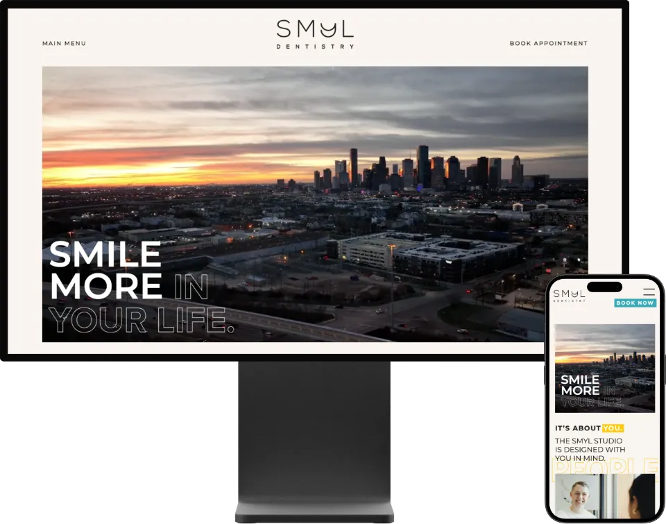
Let’s start by talking about what a people-first website is. In the context of dentistry, it’s a website that’s built entirely around the experience of your ideal patient. It “speaks human” with the goal of fostering a connection between your practice and the visitor, establishing you as the trusted expert, and providing helpful information that the patient could actually benefit from.
A people-first website should feature:
- Pages that build an emotional connection with potential patients, tell your practice’s story, confirm your expertise, and focus on your commitment to an incredible patient experience.
- Language that is natural, written in the practice’s “voice” with a primary goal of connecting with potential patients on a heart level.
- Photography & video of the doctor, the team, and the office, letting potential patients feel familiar with you and your environment before ever entering your practice.
- Videography that gives patients the opportunity to hear your voice, connect with you, and understand that they will have an amazing experience at your practice.
- Testimonials from real patients that support your promises, proving your level of expertise and service.
On the other hand, a “Google-first” website can feel impersonal and forced, with repetitive content, generic photos, and little room for genuine connection.
What about SEO?
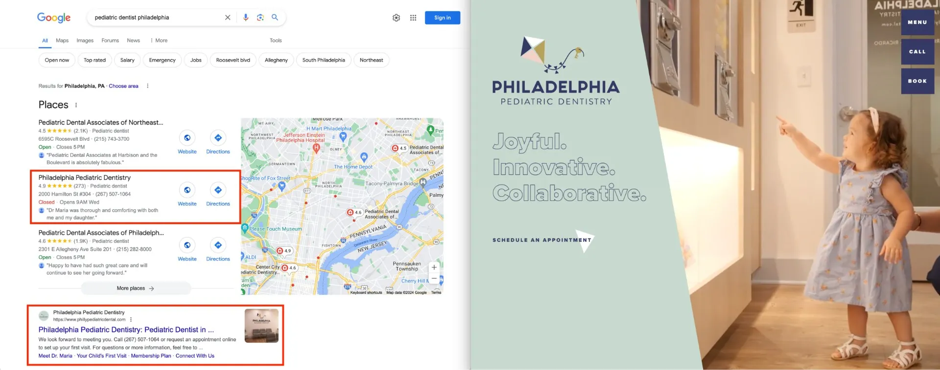
You can have the most beautiful, people-focused website in the world, but if no one can find it, it isn’t doing your practice much good. That’s absolutely true. And the good news is that you can have a website that is both people-first and search-optimized. Creating a website that focuses on people first doesn’t mean that you ignore SEO, it just means that you put SEO in it’s proper place: beneath the user experience. People-first websites still need to implement SEO best practices, but they make the commitment not to compromise the visitor’s experience for the lure of higher rankings.

Tips to create a people-first website:
1. Speak human.
Always remember that the target audience for your website is another human – not a search algorithm. The language on your site should feel natural, without overusing search keywords.
- Find your voice. Your website’s writing should reflect the “voice” that you want your practice to have. Think about your personality, as well as the personalities of your ideal patients and find a voice that connects with both. Should it be serious and professional, or light and funny? Should we use slang and emoji to be more relatable, or should we use proper grammar to connect with our highly-educated community?
- Start with why. Don’t make your website all about what you do – go a little deeper and explain why. Then explain how you do it differently. All dental practices do dentistry. Your story and expertise and the patient experience you provide is what sets your practice apart. (Watch: Simon Sinek: How Great Leaders Inspire Action)
- Tell a story. Humans are hardwired to connect with stories. Don’t just list all the information about your practice and the services you provide. Take patients on a journey to optimum oral health, where they are the hero and you are their expert guide. (Read: Donald Miller: Building a Story Brand)
.webp)
2. Make it easy.
Make it simple for people to find what they need.
- Use consistent and streamlined navigation to help your potential patients find the pages they’re looking for.
- Place clear call-to-action buttons on each page that guide the person to their next step. (Think: Schedule an Appointment, Book a Consultation, etc.)
- Consider implementing an online scheduling tool to help patients book with you more easily, or when your office is closed.
- Most people will be viewing your website from their mobile phones, so make sure it’s easy to navigate (and looks awesome) on iPhone & Android devices.
- Put critical contact information on every page – people should never have to hunt for your phone number and address!
3. Be inclusive.
Use accessibility & localization to create a web experience that everyone can enjoy.
- Add captions to videos to help those with hearing issues.
- Be sure that your site can be properly read by screen readers and take advantage of “alt text” to describe your website’s images to people who are visually impaired.
- If you have a multilingual practice, consider translating your site into your second language to serve the people in those communities better.
.webp)
4. Show yourself.
Don’t settle for stock photos. Add custom photography and video to your site to give potential patients the opportunity to see you and your practice, building trust before they ever walk in the door.
.webp)
.webp)
.webp)
5. Educate patients.
Prove your expertise by using your website as a patient education tool. Writing blog posts and creating videos about different conditions and procedures set you up as the trusted expert. (And they’re incredible for SEO too!)
6. Prove it.
Don’t just talk about yourself – use positive reviews to let your patients do the talking for you. For example, when you talk about how Dental Implants can change your smile, add a review from a patient who talks about how her new smile changed the way she feels about herself. When you talk about your relaxing, spa-like environment, include a review from a patient talking about how his visit was the most relaxing hour of his day.
.webp)
Conclusion
Creating a people-first website requires a mindful approach that prioritizes the needs of your potential patients. By focusing on humanizing your practice through authentic copy and visuals, ensuring user-friendliness and inclusivity, and leveraging patient testimonials, you're able to build a website that truly resonates with your audience. Remember, your site is not just a digital business card, but a chance to tell your story, share your values, and start forging a connection with potential patients before they step into your practice. It's time to evaluate, adjust, and transform your website into a people-first hub that truly represents your dental practice.
Need some help? Studio 8E8 is a leader in people-first, story-driven websites, and we’d love to help you level-up your practice’s web experience.
.webp)


.jpg)
