Is Your Dental Website Mobile Friendly? Here’s Why It Should Be
September 2020 was a big month. We were introduced to the cranberry juice longboarding legend, the 11th season of the Great British Bake Off aired, and Google announced that they would be changing how they primarily index* websites.
*Indexing = Google knows about your website and can rank it among search results.
Mobile First Indexing For Websites
While we love a good soufflé, we’re primarily focusing on the changes made to Google’s indexing methods instead. The change was to something called “mobile-first indexing”. Which (as the name implies) means that Google will now be indexing a website’s mobile version before they work to index the desktop version.

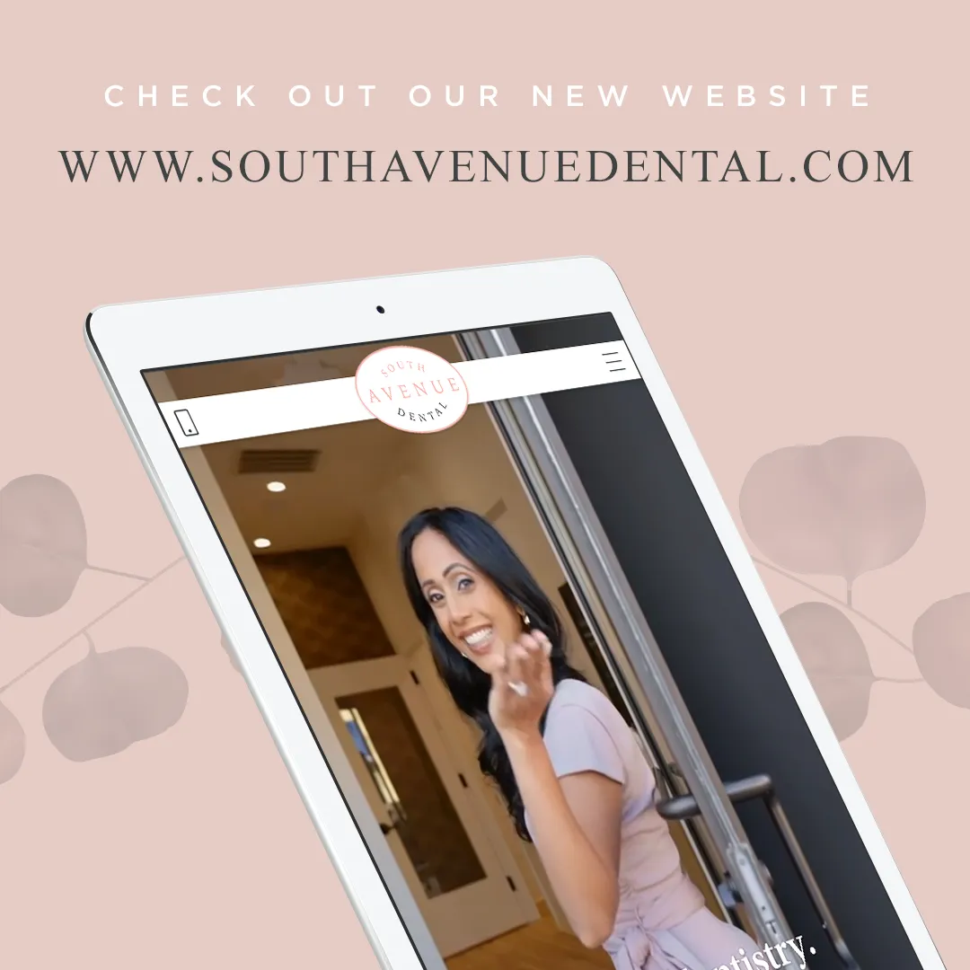
In non-Google terminology, that means that if your site doesn’t have a mobile responsive separate layout designed for smartphones (as shown above), you could be losing rankings among the Google search engine results pages (SERPs), and user experiences are almost certainly taking a hit as well.
In actual Google terminology: “Google predominantly uses the mobile version of a site's content, crawled with the smartphone agent, for indexing and ranking. While it's not required to have a mobile version of your pages to have your content included in Google's Search results, it is very strongly recommended.”
5 Key Elements Of A Mobile-Friendly Dental Website
Why do we bring up news from 2020? Because the updates made to Google’s indexing methods still impact websites that are unprepared for mobile usability today. That’s why in this article, we’ll discuss the tips and Google mobile optimization guidelines that help you ensure your website is mobile-friendly and ready for any smartphone user/potential patient.
P.S. If you’re unsure if your website is usable on mobile, you can take
Google’s Mobile-Friendly Test to find out now.
1. Responsive Design
Responsive design means your website’s layout and design can scale across various screen sizes. Whether a visitor accesses your site from a laptop, a tablet, an iPhone, or an Android, your layout, images, and text should adapt seamlessly to their screen size and offer a consistent experience.

2. Clear Call-To-Actions (CTAs)
A Call To Action (CTA) is just what it sounds like – it calls your website's visitor to an action. Whether they want to schedule an appointment, sign up for your newsletter, or contact your office directly, these CTAs must be prominently displayed and easy to find on any mobile device. You can make your buttons easier to discover and engage with by designing them large enough to tap with a finger and placing them in intuitive locations, such as after a section of text.
3. Fast Loading Times
Mobile users are often on the go and expect websites to load quickly. A slow-loading site can deter potential patients and increase your site’s bounce rates. Optimizing images, reducing unnecessary background scripts, and leveraging browser caching can significantly reduce page load times on your site and improve your website visitors’ experience. Google takes into account loading time even more with their Core Web Vitals test that will help you determine whether your website loads faster or slower than the necessary average.
4. Simple Navigation and Menus
On smaller screens, complex menus can become a hindrance. Mobile-friendly dental websites incorporate streamlined navigation menus with large enough text to read and select. Simple site navigation can allow your patients to easily find essential information such as services offered, contact details, and patient testimonials. Dropdown menus, hamburger icons, or a sticky header can also make site navigation smooth and user-friendly, ensuring visitors don't get lost or frustrated.
5. Legible Content
While cramming as much information as possible is tempting, ensuring your website’s content remains readable on all mobile devices is essential. Legible means avoiding tiny fonts, ensuring adequate contrast between text and background, and breaking up long paragraphs into smaller, more readable chunks. Narrowing down the information presented to a user on mobile means you decide the most important information for them to read and understand (cutting out the fluff).
You can even try a combination of concise text, relevant images, and even videos to make content more engaging and easier to digest. Take, for example, our client’s site, South Avenue Dental.

Why Mobile Usability Matters For Dental Websites
The digital age has significantly shifted towards mobile, and dental websites are no exception. With Google leading the charge through its mobile-first indexing, the importance of having a mobile-optimized site has never been clearer. As the window into your practice, your website serves as a first impression for many potential patients. Ensuring this seamless experience on all devices, particularly smartphones, is not just about keeping up with technology—but providing a patient-centered experience.
Studio 8E8 Is Here To Help
Thanks for reading! If you’re curious to learn more about transforming your current site into a mobile-friendly masterpiece or looking to build yours for the first time, leave us a message – we’d love to help out.
%20(5).webp)

