The Best Dental Practice Websites of 2025
Studio EightyEight's Top 20

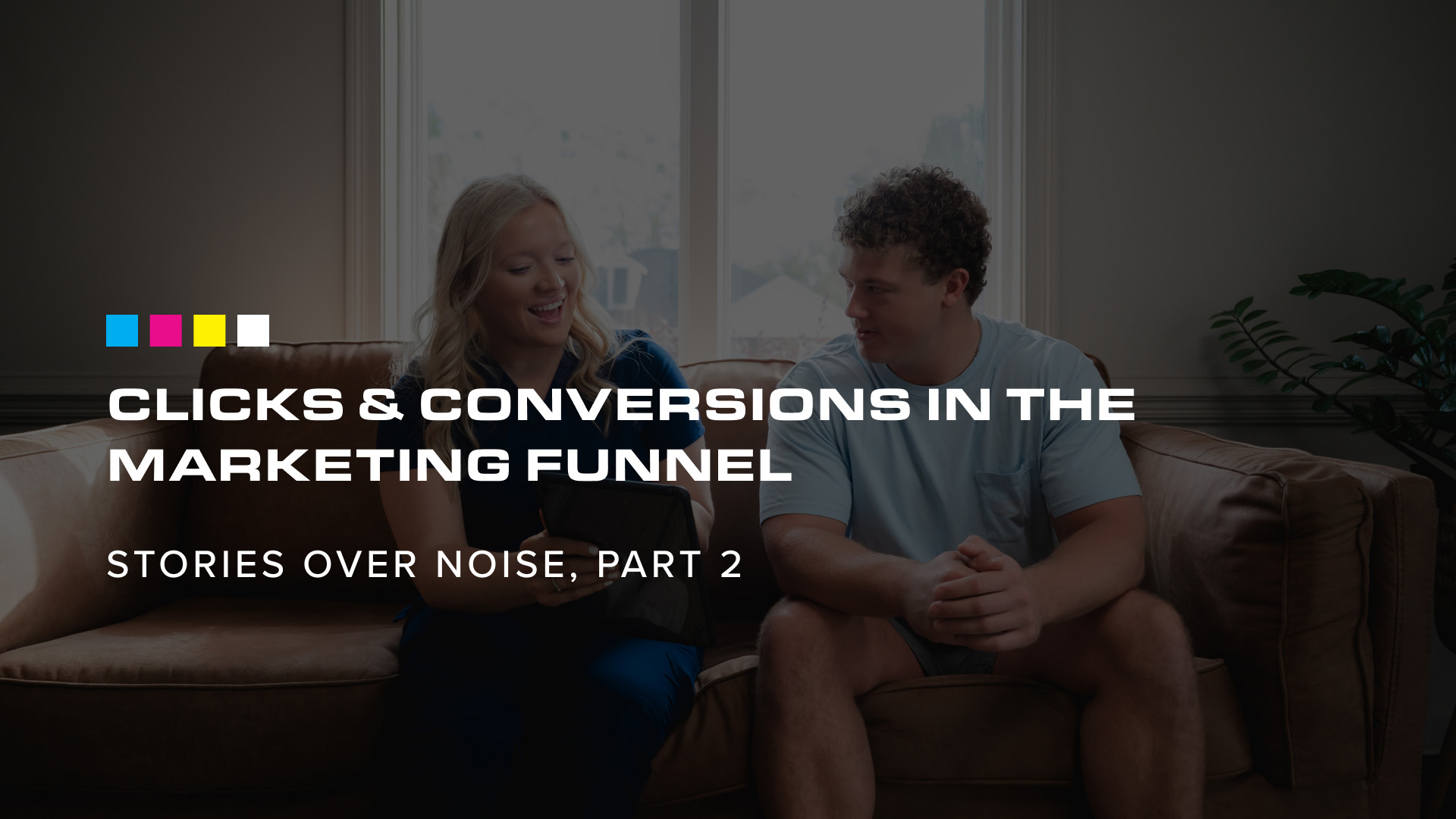
Websites tell your story.
In 2025, at times it seemed like websites had to be defended as an important part of a business’s digital footprint. With social media, listings on search sites like Google, and even the AI boom, a website can sometimes feel secondary and be put on the back-burner.
At Studio 8E8, we see your website as your true home base on the worldwide web. Everything points to it — your business listings, your social profiles — and as a marketing tool it’s the final stop (and sometimes still the first impression) before users take action to see you in person. And it’s where you have complete control over your design and message.
As an extension of your brand, the best websites have personality and character. They need to be user-friendly and promote the most important information for users, but a storyline should weave through and tie it all together.
That’s the type of website Studio 8E8 delivers for our dental clients — we call them StorySites. They’re made to bring your story forward while promoting practice growth through marketing, and each of them is one-of-a-kind.
Our Favorite 2025 StorySites
1. Arbor: A Dental Concept
Arbor’s website feels more like a modern design studio than a dental practice, thanks to its dark, calming palette, airy layout, and refined typography. Small details, like smooth hover states and animations, add polish without overwhelming the experience. It’s quietly confident, cohesive, and memorable.
.png)
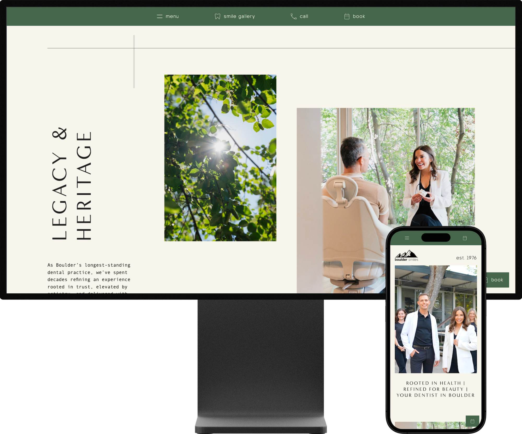
2. Boulder Smiles
Boulder Smiles’ website feels bright and welcoming, with generous use of natural light, lifestyle photography, and a calm color palette. The layout is straightforward and easy to navigate, allowing the visuals to take the lead. It’s a great example of how clarity and warmth can work together without feeling overdesigned.
3. Casco Bay Smiles
This website has a classic, coastal feel, using nautical colors and traditional design elements to reflect its Maine setting. With a clean, familiar layout, the site is easy to navigate without a compass. It’s established, approachable, and well-suited to a long-standing community practice.
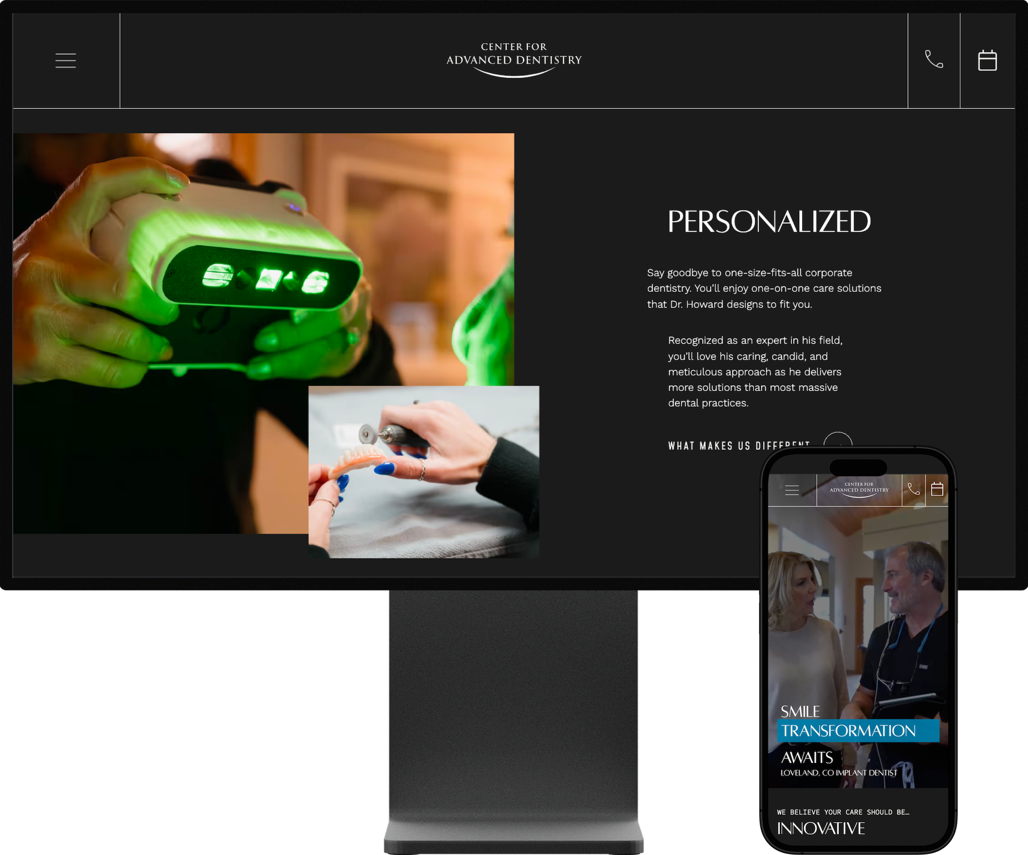
4. Center for Advanced Dentistry
Center for Advanced Dentistry’s website strikes a confident, no-nonsense tone that mirrors that practice's focused specialties. It's clean and purposeful, with bold design choices and generous use of before-and-after imagery that centers their core services.
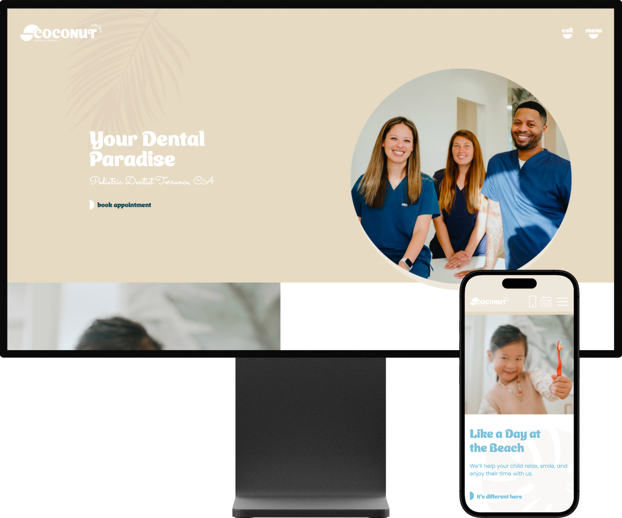
5. Coconut Smiles Pediatric Dentistry
This pediatric site opens with a bright, beach-inspired vibe that sets a cheerful tone right away. Fun, family-friendly photography and playful copy lean into their “day at the beach” theme. It feels inviting for parents and kids alike, with personality that mirrors the practice’s focus on positive, relaxed experiences.
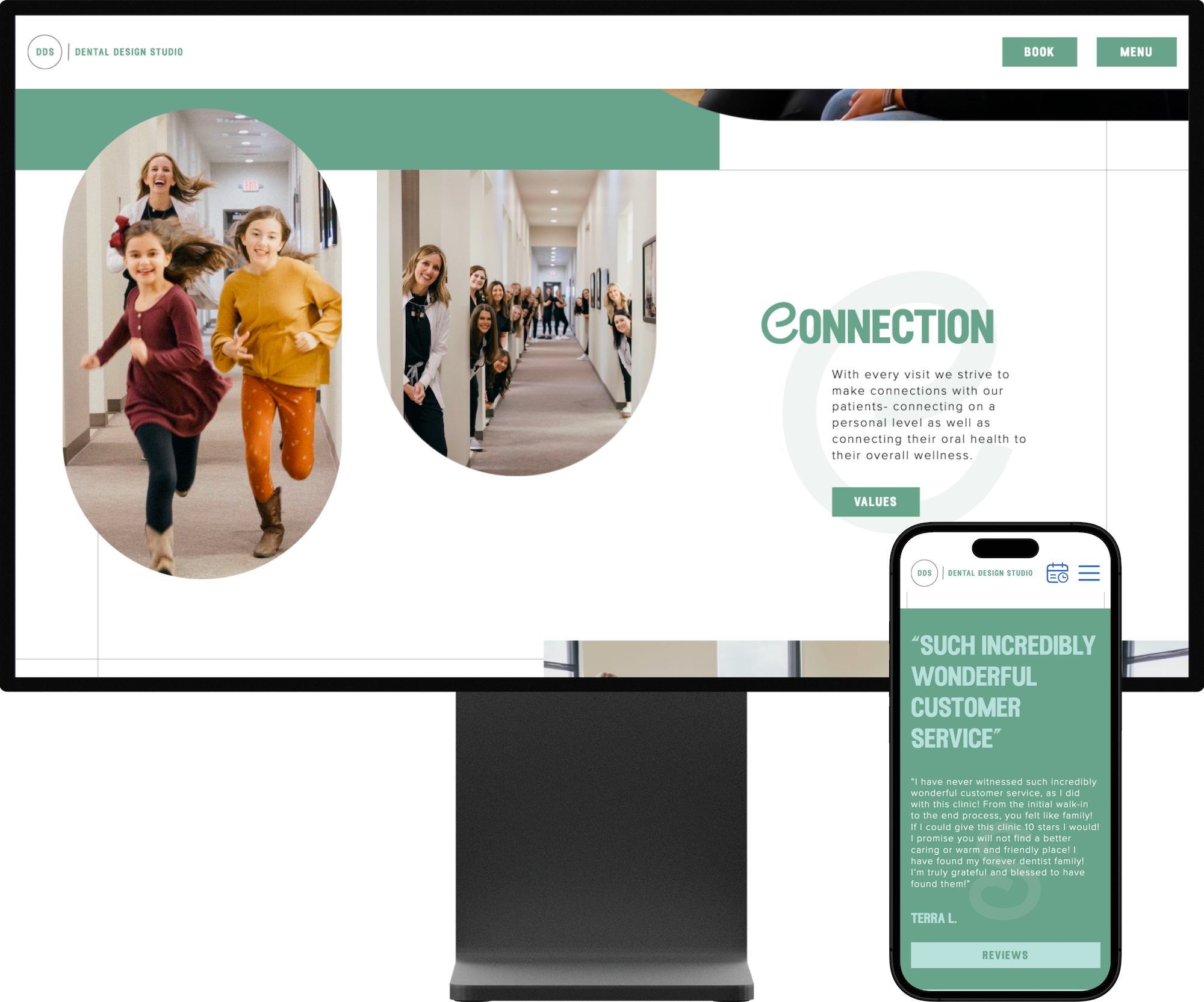
6. Dental Design Studio
Dental Design Studio’s site feels grounded and dependable, but with a playful twist —especially in the swirly typography and fun photo shapes. The layout keeps things simple, yet the unexpected angles and rounded frames give it personality. It’s modern and friendly without trying too hard.
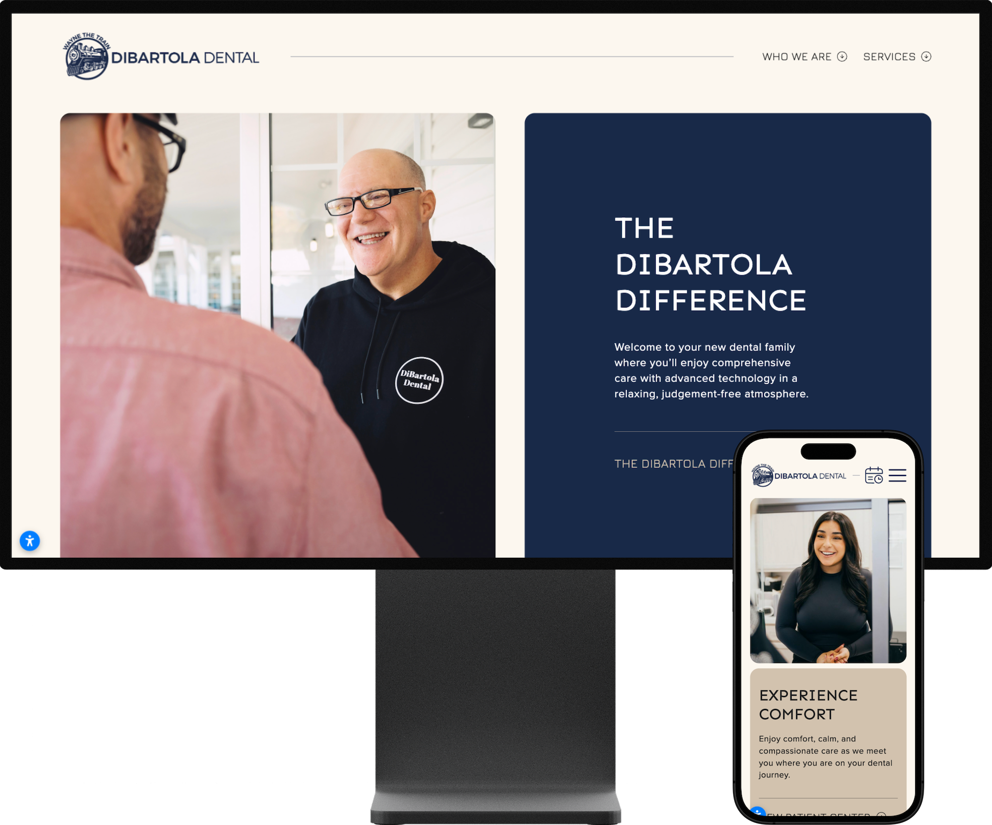
7. DiBartola Dental
DiBartola Dental’s site has a friendly vibe, with a cheerful color palette and bold photography. The train logo adds a fun, memorable touch, and the design leans into that theme without feeling gimmicky. It’s a welcoming, neighborhood-friendly site with a punch of personality.
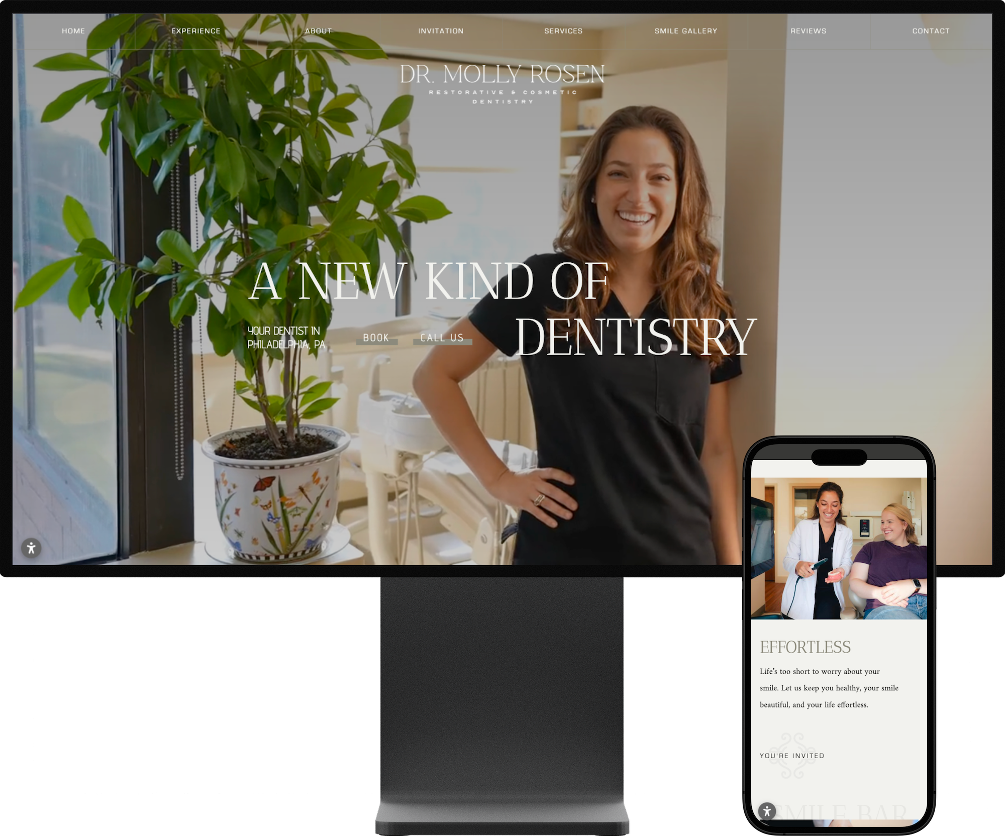
8. Dr. Molly Rosen
Dr. Molly Rosen’s site is an extension of her persona in web form: open, bright, and confident. The serif fonts and vibrant color accents give it a smart, modern edge, while the overall layout stays welcoming and easy to navigate. It’s “elevated warmth” in a dental website.
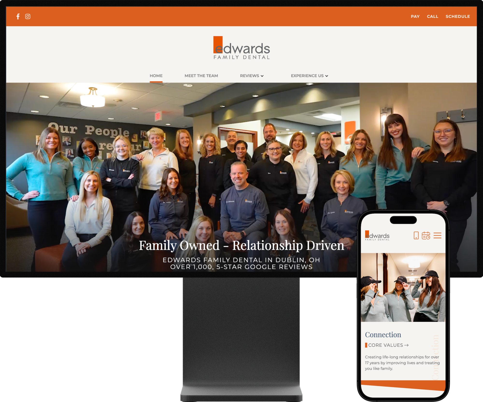
9. Edwards Family Dental
Edwards Family Dental’s website feels warm and friendly while embracing a creatively modern look. Bold colors, artistic shapes, and a distinctive logo give the design an artsy edge, balanced by clean, contemporary typefaces. It’s a fresh, confident aesthetic that feels both approachable and intentional.
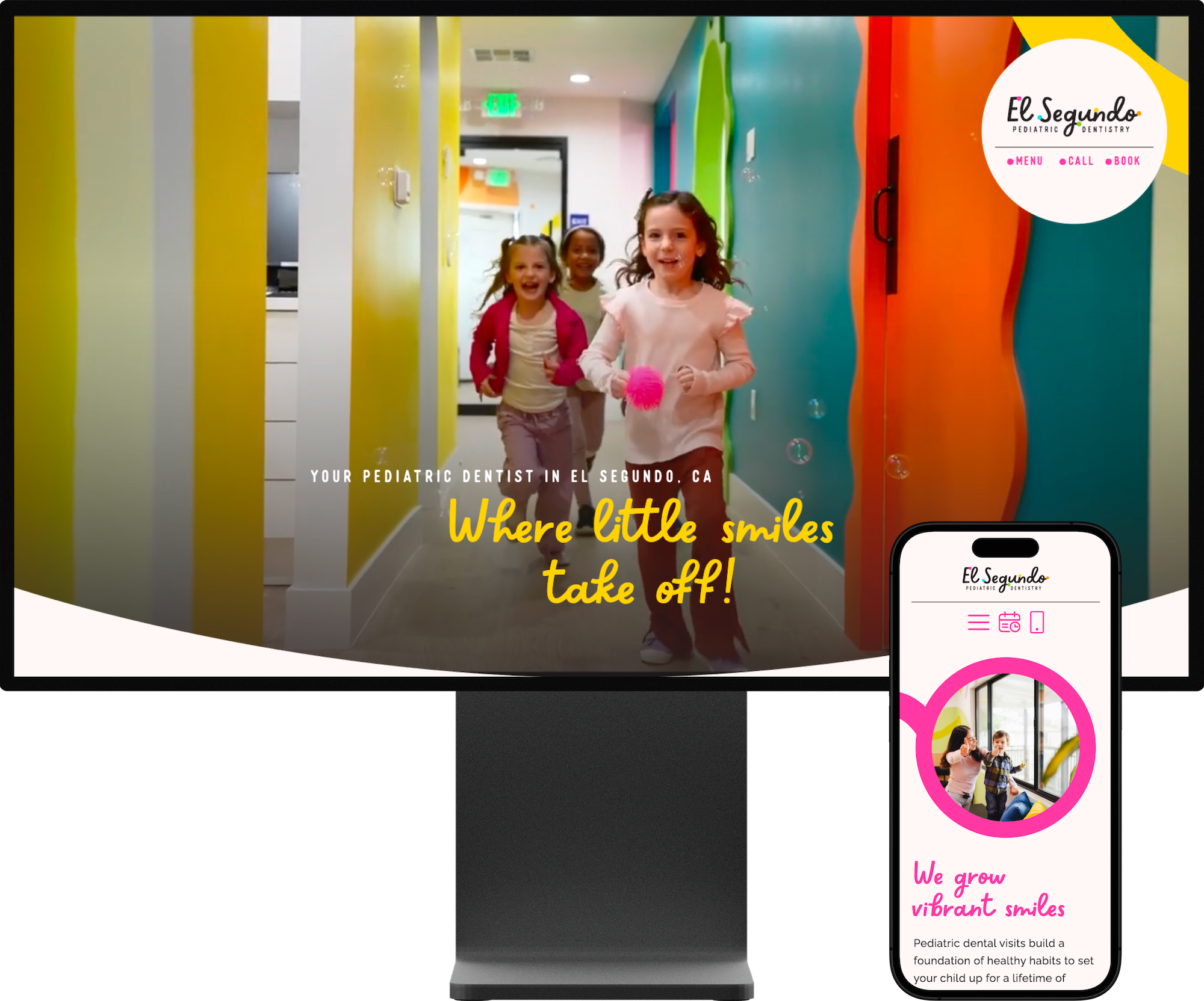
10. El Segundo Pediatric Dentistry
El Segundo Pediatric Dentistry’s site bursts with color and quirky energy, echoing the playful murals and squiggly shapes of the office interior. Vivid hues and lively graphic elements make the design fun and joyful — just right for a pediatric practice. It’s bright, cheerful, and instantly inviting for kids and families.
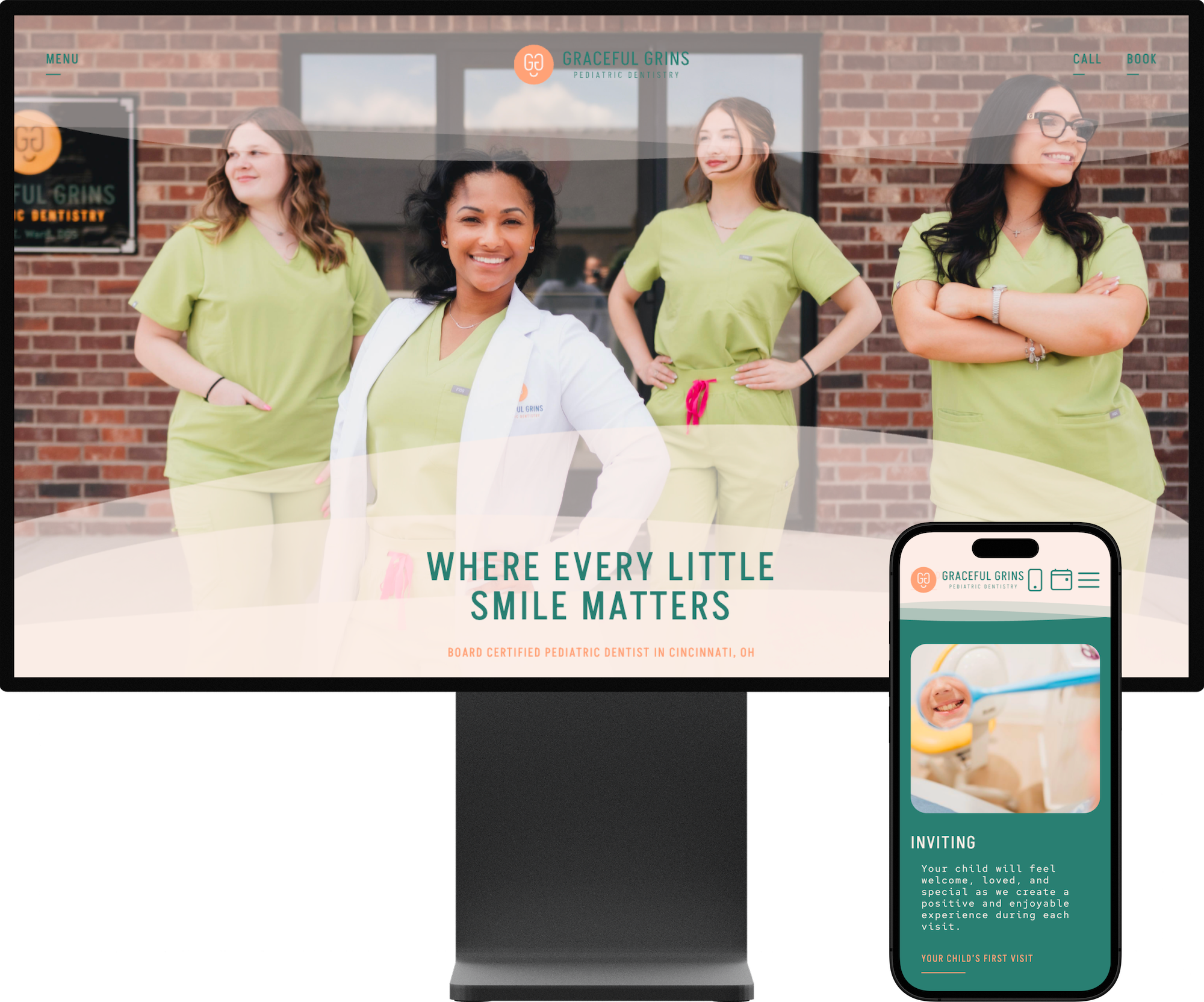
11. Graceful Grins
Graceful Grins’ website stands out with an unexpected, artful palette of pastels and teal that feels fresh. Thoughtful photo editing makes the imagery feel like it was made for the design, blending seamlessly with the layout. The monospaced typography adds just the right amount of modern character to the whole look.
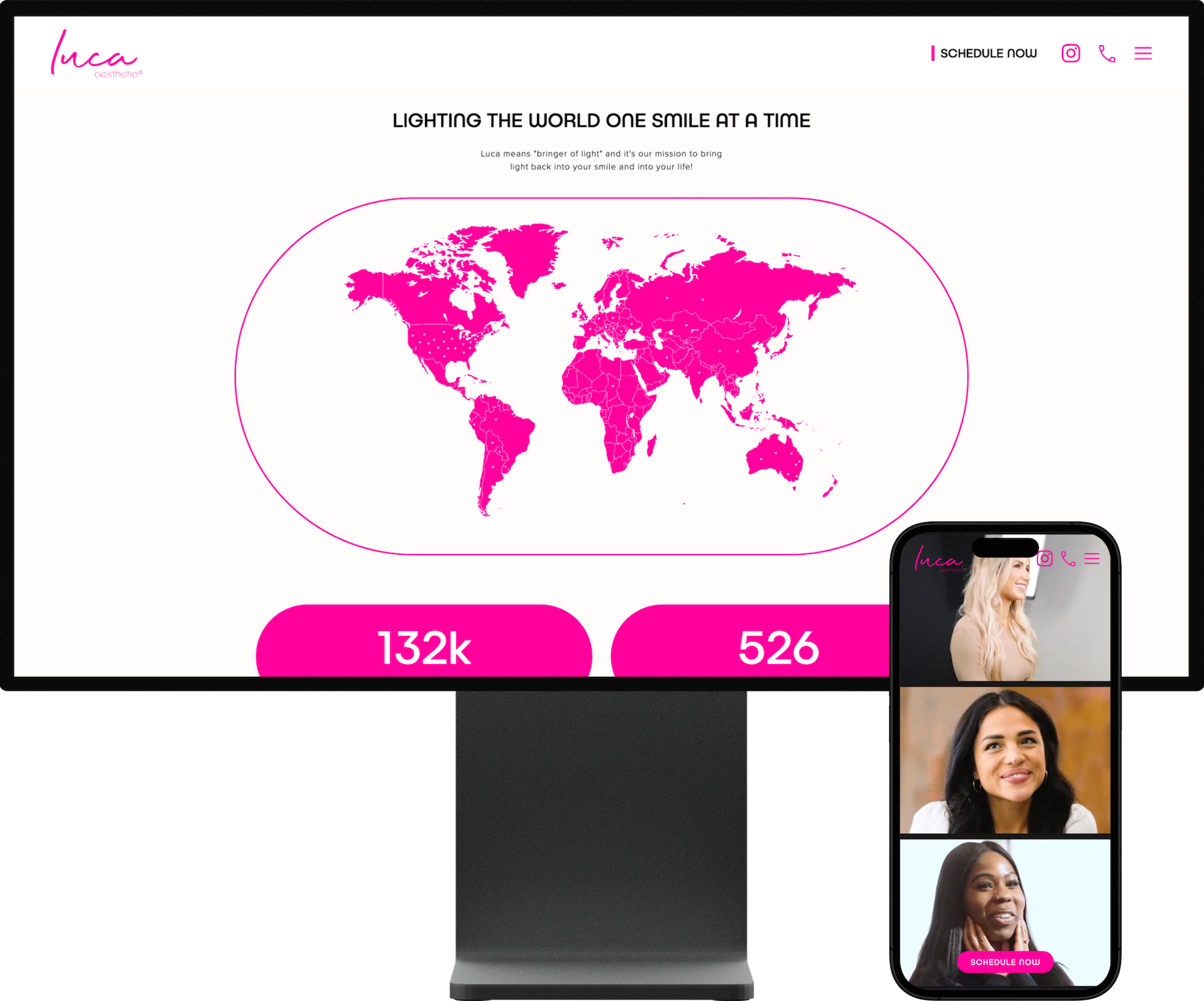
12. Luca Aesthetic
Luca Aesthetic’s website makes a striking first impression with its hot-pink branding and high-impact hero video that immediately grabs attention. Smooth, eye-catching animations throughout add a real wow factor. It’s bold and unapologetically stylish — a perfect match for an aesthetic practice that wants to stand out.
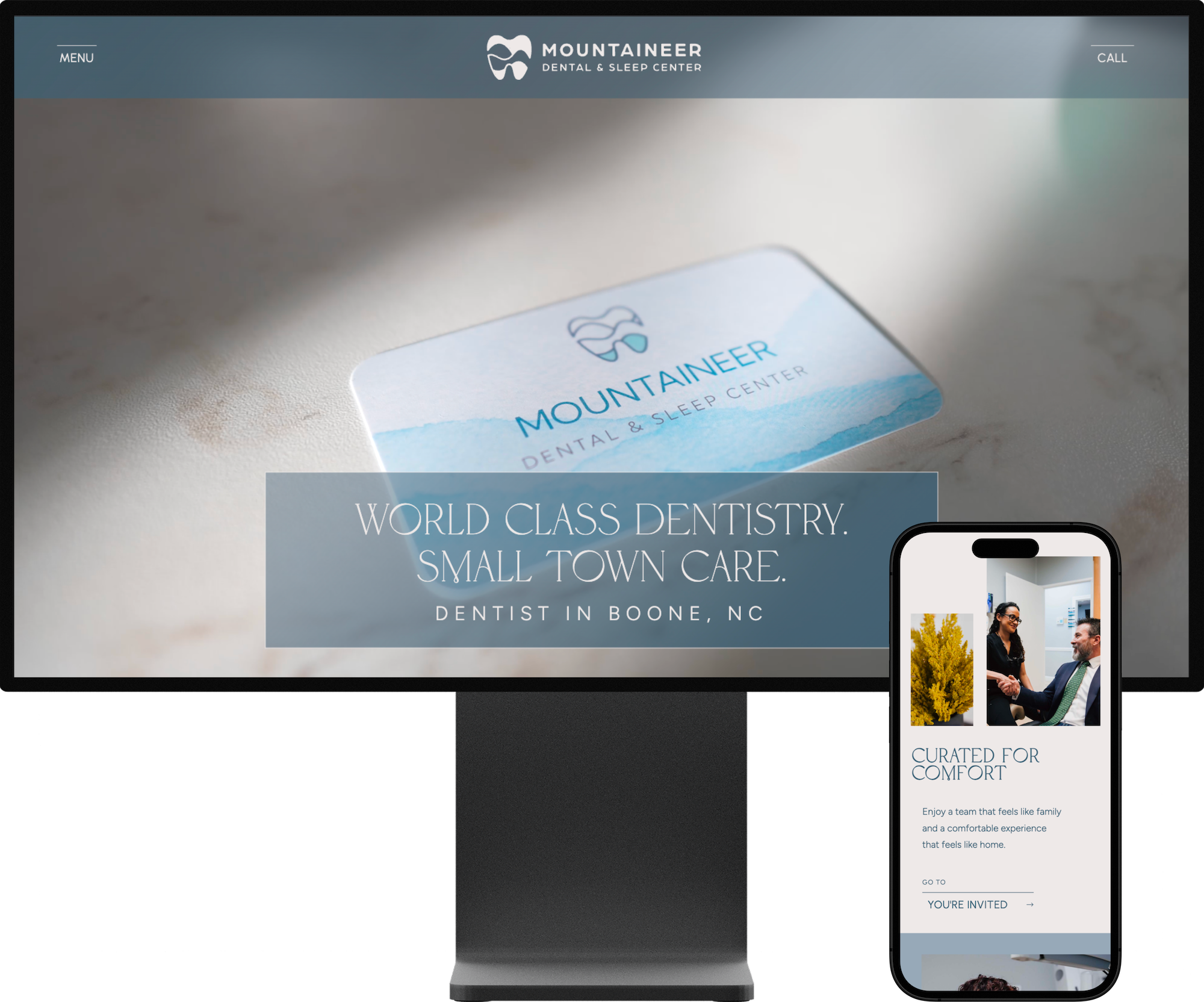
13. Mountaineer Dental & Sleep Center
This website pairs relaxed, community-centric messaging with clean, approachable design that feels like a friendly first handshake. Plus, the minimalism of the design and calm color tones are perfectly suited to a dental and sleep center.
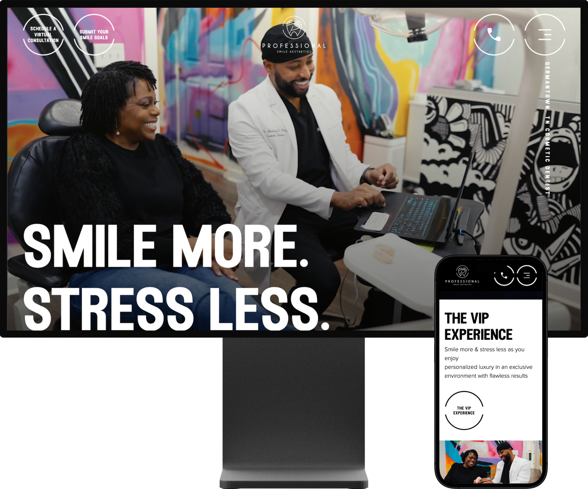
14. Professional Smile Aesthetics
Professional Smile Aesthetics is loud, bold, and a little edgy in the best way — a dental site with an artistic personality. The high-contrast visuals and creative photography give it real energy, and the standout design is expressive and unapologetically fun.
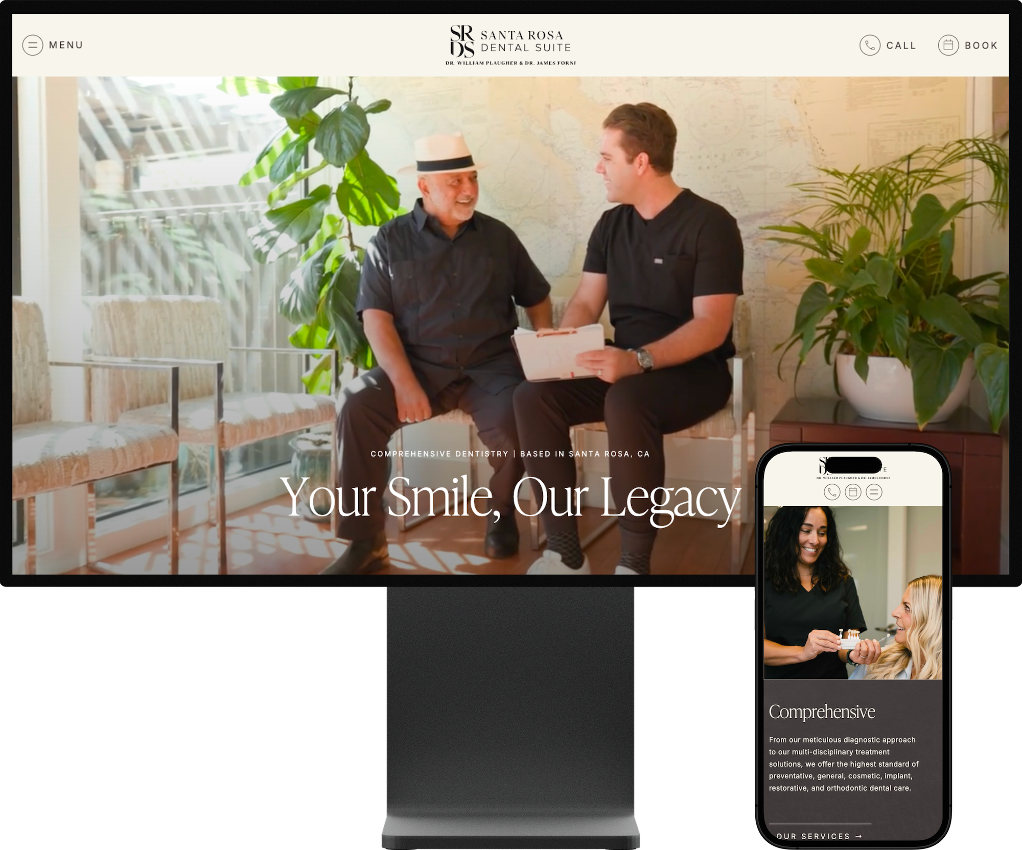
15. Santa Rosa Dental Suite
Santa Rosa Dental Suite’s website feels calm, cool, and collected, with a warm, inviting vibe that’s easy to settle into. The clean layout and easy-to-read content make it approachable, while the vertically scrolling words add a subtle editorial touch. It’s a polished, simple design with just enough personality to feel memorable.
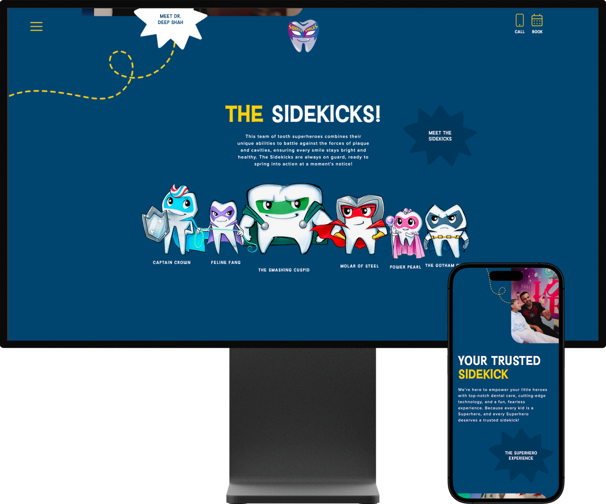
16. Sidekick Smiles
This website leans full-on superhero fun, with spinning animations and comic-inspired visuals that make the experience playful and energetic. The mascot characters and bold theme give it a storybook vibe that both kids and parents will smile at. It’s a joyful, character-driven design that doesn’t take itself too seriously.
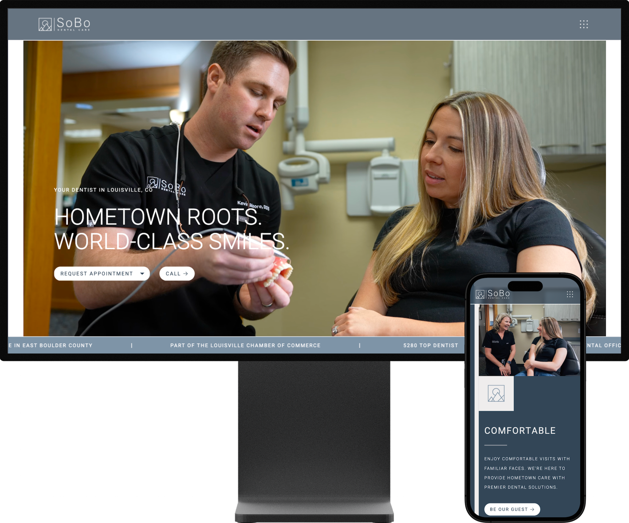
17. SoBo Dental Care
SoBo Dental Care’s website opens with a slick load-in animation and scrolling hero text that sets a dynamic tone right away. The design stays uncomplicated and purposeful, letting the logo and branding take center stage. Clean layout and understated visuals make the experience feel modern without getting in the way.
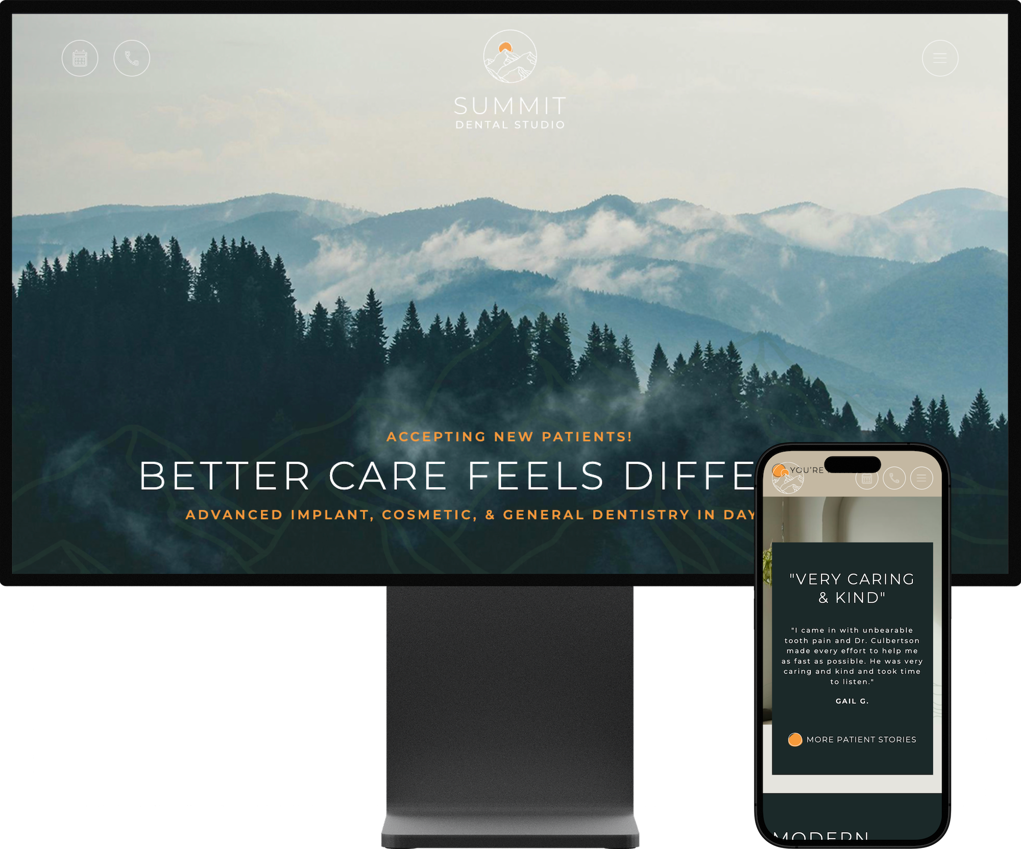
18. Summit Dental Studio
Summit Dental Studio’s website is super clean, but little surprises keep it interesting. Unexpected layout shifts and clever use of the logo in backgrounds and buttons, for example, give the design a distinct, polished personality. It’s a refined, modern look with just enough visual flair to stand out.
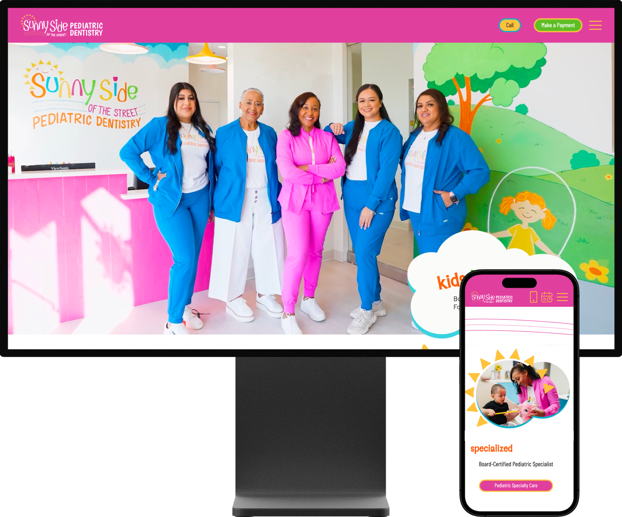
19. Sunny Side of the Street Pediatric Dentistry
Sunny Side's website leans fully into its theme with playful sun and street graphics woven throughout the design. The illustrated elements feel interactive and seamlessly integrated, not just decorative. It’s bright, kid-first, and genuinely friendly in a way that makes the whole experience feel welcoming and fun.
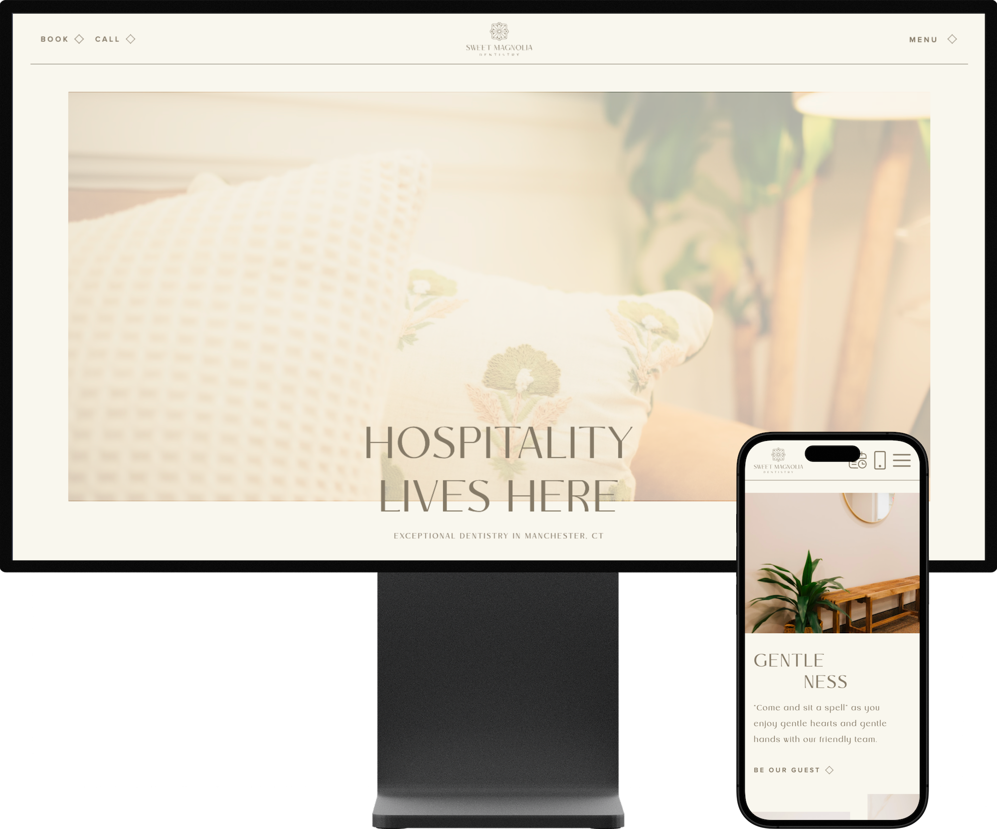
20. Sweet Magnolia Dentistry
Sweet Magnolia Dentistry’s website feels elegantly composed with a muted, calming color palette. The scrolling feature in the home page bio section is a lovely little “wow” moment that feels almost cinematic. It’s stylish and understated, with a charm that is warm and welcoming.
And that’s a wrap on another year of standout dental websites — each one a unique reflection of our clients’ care, passion, and commitment to their patients. You truly inspire us.
If you’ve been thinking, “I want a website like this for my practice,” we’d love to hear from you. Send us a message at S8E8.com or slide into our DMs on Instagram @studio8e8.