It's Brand Season, Baby
Why 2024 is the Year To Invest in Your Visual Identity
Hi there. I’m Joanna Scott with Studio EightyEight, dentistry’s story-driven marketing agency. Our passion is to help dentists and dental entrepreneurs discover their story and then share it in the digital space so it gets attention.
My goal for today is to spotlight the value and importance of your brand's identity in attracting your “soulmate” client and the community of people you're called to serve. You’re not like anyone else, so why should your marketing look like anyone else’s? You want a successful and profitable business, so I'd love to spend a few moments discussing the value in developing your brand's look and feel.
Personal branding expert Mike Kim, author of the book You are the Brand, breaks down three elements to every brand and the importance of alignment between them: a visual identity, verbal identity, and value identity. If one of these areas is "off" or does not represent who you are, what you do, and how you do it then your entire brand will be unstable. If they're aligned, you have a clear and cohesive brand identity.
In this article, we’ll focus on what your “visual identity” represents…
VISUAL IDENTITY – A brand's visual identity is simply the branding components to how people actually "see" your brand. Most of the time we think of branding and logos, but this also includes any type of imagery (photos or videos), the fonts and colors on your website… all of it.
BIG BRAND EXAMPLE
A great example of a brand that shows up consistently for the female audience is SPANX. How many ladies can give me a YES when it comes to the wonders of Spanx! Their logo, font and colors are consistent anytime you see it online, in stores and on their product packaging. The brand is all about empowering women of all shapes and sizes to feel their best self. Founder Sara Blakely has done an excellent job of evolving the look of Spanx while carrying the feminine and voluptuous shape of a woman’s body throughout the brand’s visual components. When you see SPANX in stores, you know what the brand is and what it stands for. I mean, ladies…Can you imagine not having faux leather leggings?

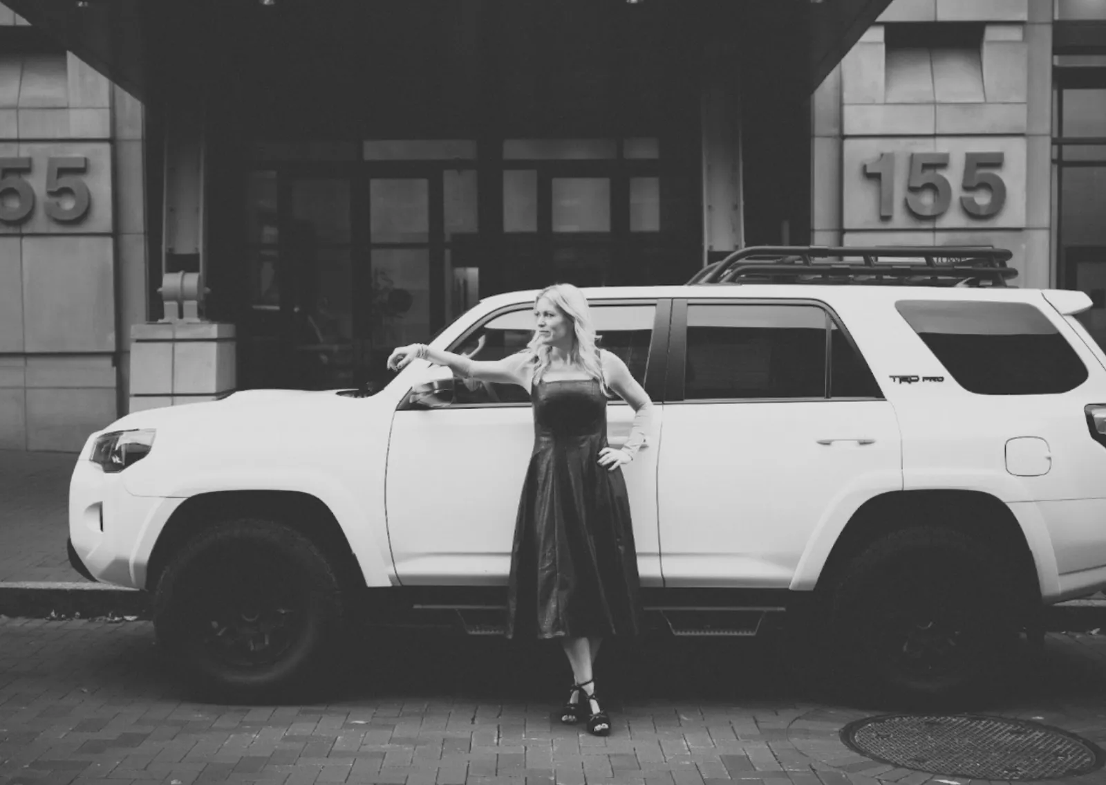
Another aspect of your visual identity, especially if you have a personal brand, is your wardrobe. Speaking of leather, I remember talking with Minal Sampat to help me clarify some of my personal brand's identity. She helped me figure out that black and neutrals, particularly black leather, is a signature look for me. Don't judge me, but I have 3 leather jackets, 1 leather shacket, a leather jumpsuit, and of course faux leather leggings from Spanx. It's a whole vibe and it makes me feel powerful and happy when I'm wearing it.
Another aspect of your visual identity, especially if you have a personal brand, is your wardrobe. Speaking of leather, I remember talking with Minal Sampat to help me clarify some of my personal brand's identity. She helped me figure out that black and neutrals, particularly black leather, is a signature look for me. Don't judge me, but I have 3 leather jackets, 1 leather shacket, a leather jumpsuit, and of course faux leather leggings from Spanx. It's a whole vibe and it makes me feel powerful and happy when I'm wearing it.
STUDIO 8E8 CLIENT EXAMPLE
One other amazing example of a brand who has clearly spent time defining how they want to show up for their audience visually is the Geriatric Toothfairy, Mrs. Sonya Dunbar. I love how Sonya uses bright, bold colors in her wardrobe combined with her electric personality coming through in all of her social posts. It takes intentionality to weave the same colors, vibe and esthetics throughout your brand, and completely validates your services and offerings.

I recommend you take some time to figure out not only your wardrobe but the look of your photos/video, fonts and colors on your website and social feed. Spending some time clarifying your visual identity will pay off big time!
What’s the first (and most important) step toward building visual cohesiveness for your brand? I’m so glad you asked!
Book a custom brand shoot with an agency you can trust.
HOW IT ALL STARTED…
In 2018, Studio EightyEight noticed a growing need in the market for custom, luxury brand photography and video shoots for dental entrepreneurs. We were so excited to flex our creativity to produce unforgettable experiences for each client, while “wow-ing” them with content that helped them get attention and distinguished them among their competitors.
Throwback to our first two brand sessions…
Dr. Shakila Angadi, The Inspired Dentist
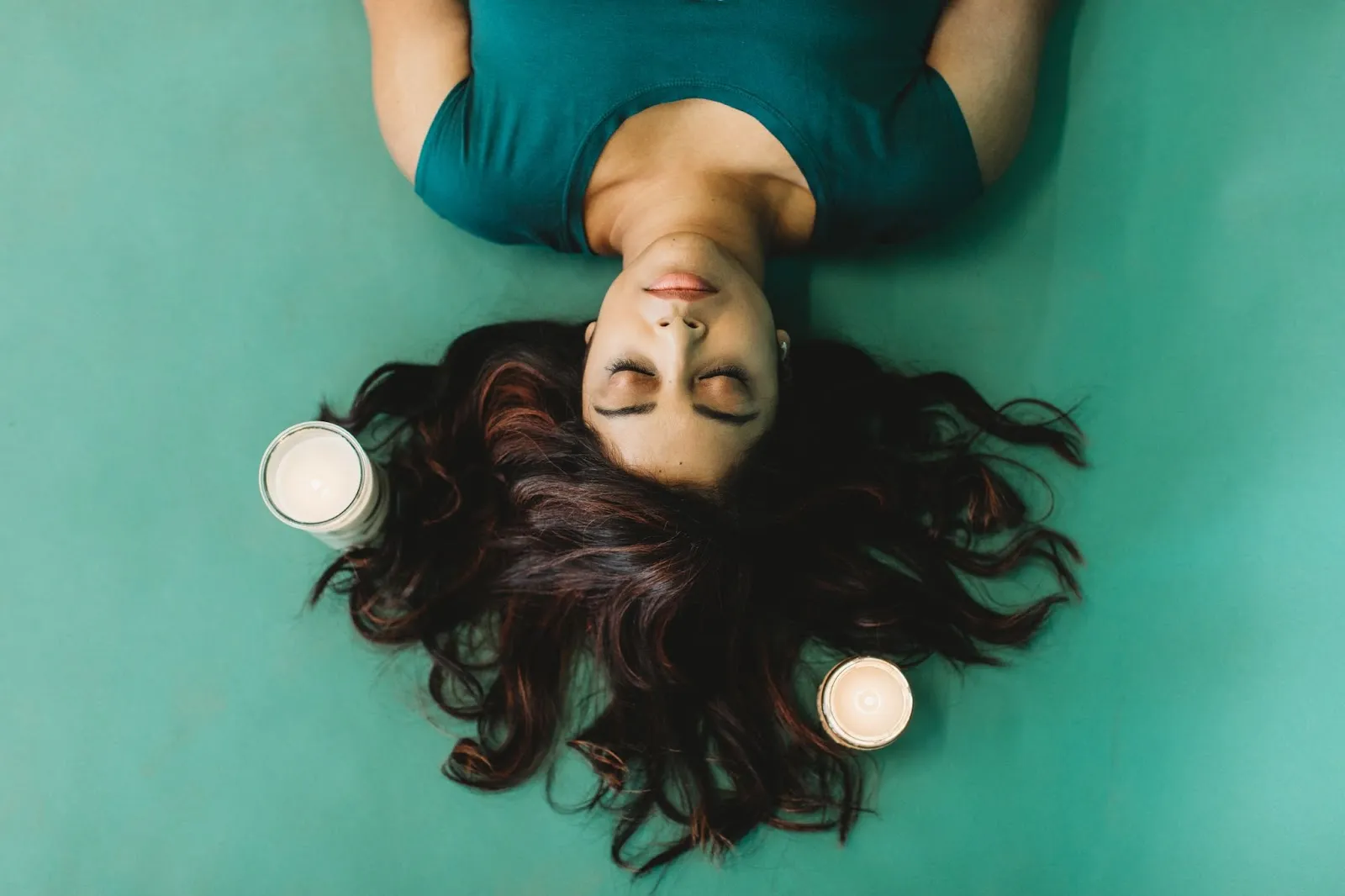
I began listening to a dental podcast called the Inspired Dental Life with Dr. Shakila Angadi and Dr. Glenn Vo. I was intrigued by this dentist-turned-emotional health and mindset coach, and knew I needed to meet her. Fortunately for me, I ran into her at a conference and immediately approached her like a raving fan girl and gasped, “Are you the Inspired Dentist?!” She kindly smiled and we became friends after that. We hosted Shakila for an all day photography session and our team dove into customizing the experience to represent the esthetics of her brand. My favorite moment was when our photographer, Caroline, staged a scene where Shakila laid on a yoga mat with her hair spread perfectly around her with carefully placed candles to showcase zen meditation vibes. It was a whole thing! Our team had a blast over-delivering with this session and continues to enjoy thinking outside the box with each project to enhance the customization of these brand shoot experiences.
Michael Arias, The Dental Marketer
2018 must have been the year to meet cool people, because we also met Michael Arias, known as The Dental Marketer. He was so kind introducing us to people at our very first dental conference… Michael knew everyone! Michael’s brand puts the spotlight on ground marketing techniques for your dental practice and is one of the godfathers of podcasting in dentistry. We hosted Michael for an all day photography and video brand session in Columbus, Ohio and rented a studio in an urban setting that matched the look of his brand. An iconic moment happened when our photographer told Michael to toss an apple up into the air and catch it while walking. Thankfully, he’s a great multi-tasker and he nailed it! Michael’s brand colors are vibrant orange and red tones, so working an apple into this creative shot added an extra layer of cohesiveness visually.

Let’s jump forward to 2023 to put the spotlight on a few of our favorite brand sessions and show you what we loved about the uniqueness of each one.
Dentistry Unmasked - It’s all about the PROPS!
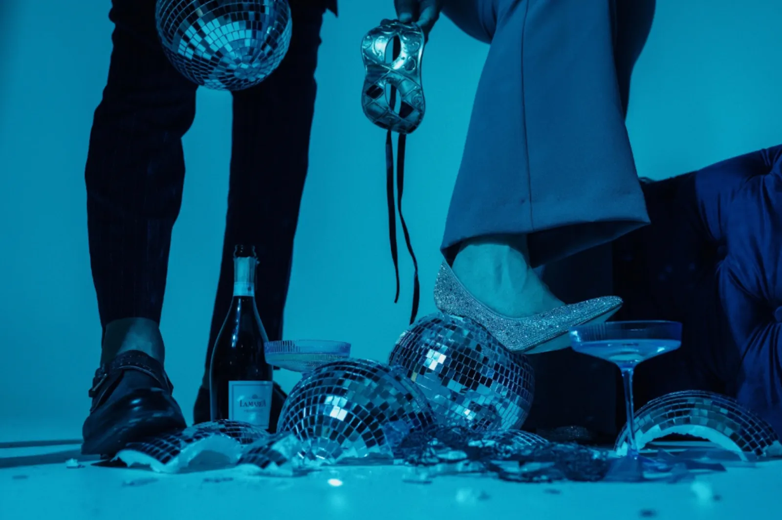
Let me introduce Dr. Pamela Maragliano-Muniz and Dr. David Rice, the creators of a new podcast called Dentistry Unmasked. We hosted them for a photography session to capture content for their upcoming podcast launch. Currently, Pamela is the Chief Editor of Dental Economics, while David is the Editor of Dentistry IQ. The brands are under the same umbrella and their podcast was highly anticipated. The goal was to podcast with opinionated people in a round table-style discussion with themselves as the consistent hosts for the most part. They wanted to push the envelope a little, slightly sassy. The content that came out of the photography session would drive the look of the overall brand. Our creative team cooked up some insane props and staged scenes we’ll never forget. This photo pretty much sums up the edgy goal of the shoot. I mean what’s not to love about a stiletto slammed into a disco ball?
Dr. Lior Tamir - Style Discovery Resource
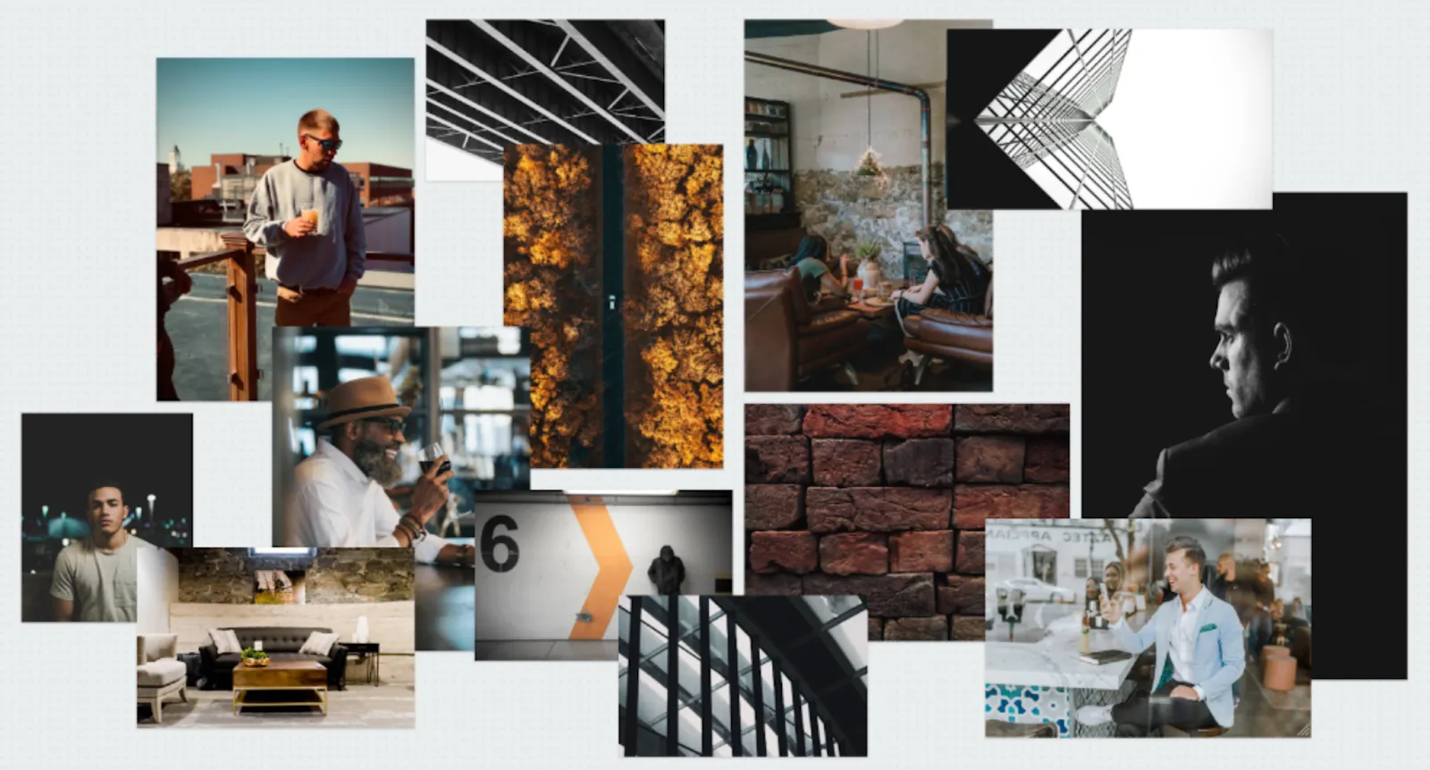
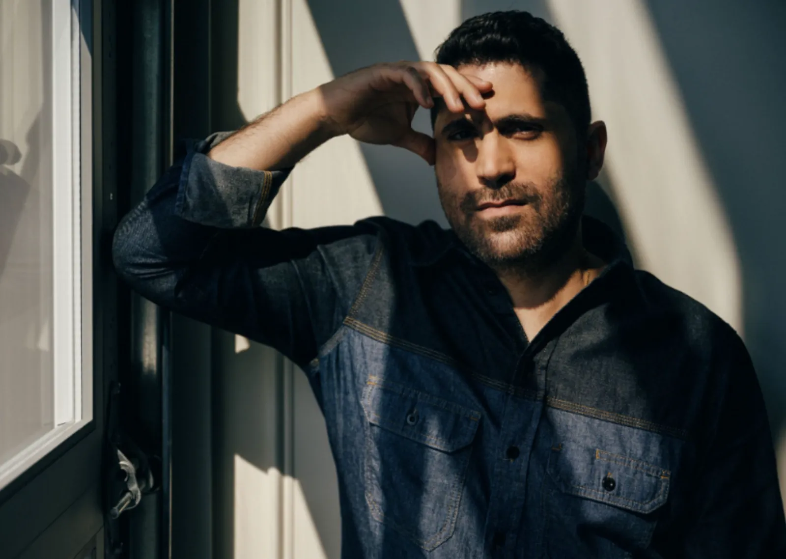
Next up is Dr. Lior Tamir! He is an expert cosmetic dentist in Silicon Valley, leveraging years of training and expertise with the latest cutting-edge techniques to craft beautiful smiles. Tamir was looking for more photography and video content for his personal brand. One of the ways we sync up with our client’s visual goals is through our discovery process. Studio EightyEight’s Style Discovery Guide captures our brand client’s preferences when it comes to colors, fonts and mood boards. Our creative team then takes their selections and personalizes an inspirational starting point that sets the tone for everything, including studio space, props, lighting, staging and wardrobe. As you can see from Dr. Tamir’s personalized mood board, the goal for his content was to represent high-level dentistry with a dark, moody feeling, clean backgrounds and not a lot of noise. This creative process helps our team understand the look and feel every client is going for.
Smiles Across Montana - Location, Location, Location!
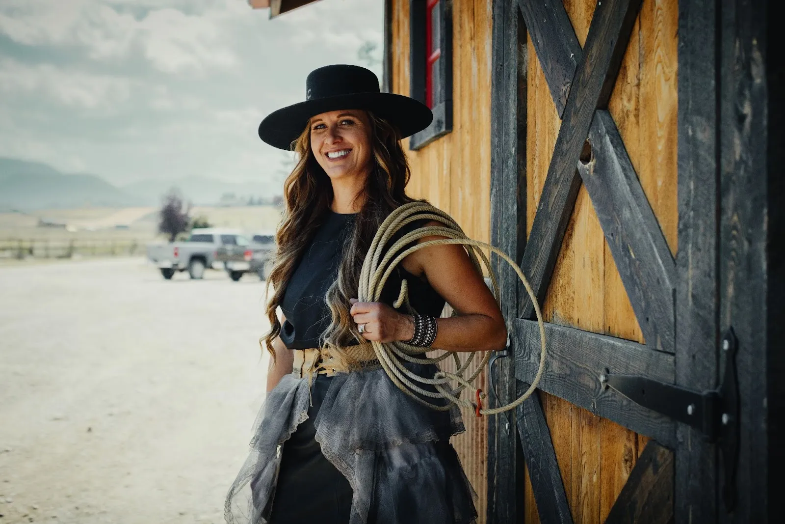
Crystal Springs is the founder and creator of Smiles Across Montana, which provides underserved communities in the state with access to dental care through her mobile units. The goal was to help capture photography and video to help tell the story of SAM. We jumped at the opportunity! Not often, but sometimes a client’s location has unique qualities that really represent their brand in a way that would be challenging for us to reproduce in a studio. Since this was the case with Crystal, who lives on a ranch in Montana, our team traveled West. It was incredible to see her state-of-the-art mobile dental clinic, capture an epic team photo in front of a neighborhood school where they provide dental care and end the day on her ranch with her family, dogs, horses and bulls. It felt so authentic to her brand because it was.
Dr. Tina Saw - The Why Behind What You Do
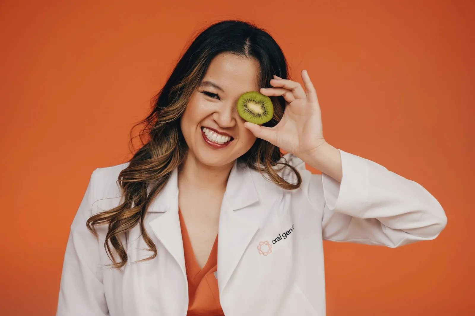
It's easy to say we work with the best humans on the planet and Dr. Tina Saw is one of them. Her life-saving technology, Oral Genome, is using advanced technologies to change how oral care works by identifying potential health issues before they start. Tina Saw has an incredible story and we were thrilled to help her tell the story behind the great work she’s doing. Sometimes people think they don't have a cool enough story or that their “why” isn't big enough to be shared with the world. We believe everyone has a story worth sharing! To prove it we created a discovery tool called the Brand Creator that helps people discover their story and clarify their reasons behind what they do. You might not be creating an at home saliva test like Tina Saw but I guarantee what you offer your patients, clients and community is amazing, unique and worth marketing!
Wrap Up…
If you feel inspired to elevate your brand’s identity, then having a bias for action is your next step! There are so many other ways you can figure out and test what you want your visual presence to be. Begin with asking yourself, how do you want to show up for your clients, partners, and audience? Then go from there… Sometimes we need a reminder that our stories are worth it. They are worth investing in and sharing with the community we're meant to serve. Each of you are world-changers and if that's true, then now may be the perfect time to take a step towards investing in your brand's identity.
If you’re ready to book your very own brand shoot, then we’d love to hear from you! https://s8e8.com/
.jpg)
.jpg)
