
Top 20 Dental Practice Logos
Our 2024 Picks
.jpg)
Symbolizing Your Story
Logos are visual storytellers that stand at the forefront of your brand, communicating a message and evoking a feeling. Which makes them really important markers of your overall identity as a dental practice.
At Studio EightyEight, we understand a logo’s significance. Whether you’re a brand-new startup, a pediatric dentist, or an advanced specialist, your logo needs to be inviting, reassuring, and unforgettable.
So we’re at it for another year, putting together a list of the best dental logos from 2024. Whether you’re searching for inspiration or just want to see some amazing dental logos, this article is for you! These logos bridge the gap between clinical healthcare and the warm, personal touch we all want to feel when we visit the dentist. We helped these practice owners bring their stories to life visually by using colors, fonts, illustrations, and custom designs to communicate the uniqueness of each practice in their own artistic way.
Without further adieu, and in no particular order, we present 20 truly exceptional dental logos…
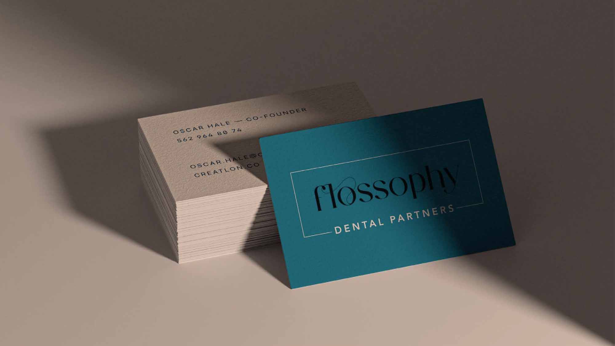
1. Flossophy Dental Partners
A little nod to floss fit in perfectly with this modern serif font, and a box with light strokes completed the look of this balanced, fanciful logo.
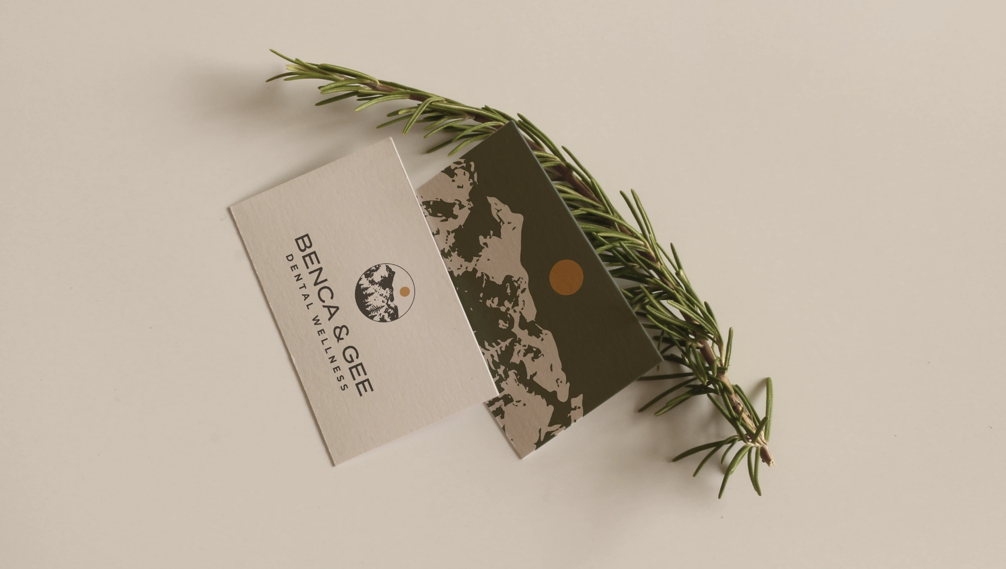
2. Benca & Gee
Nature was the defining element in this practice’s brand. Rather than simplifying the striking imagery, we produced something with more textural complexity to stay true to the landscape, while the repeated circles give a sense of holistic wellness.
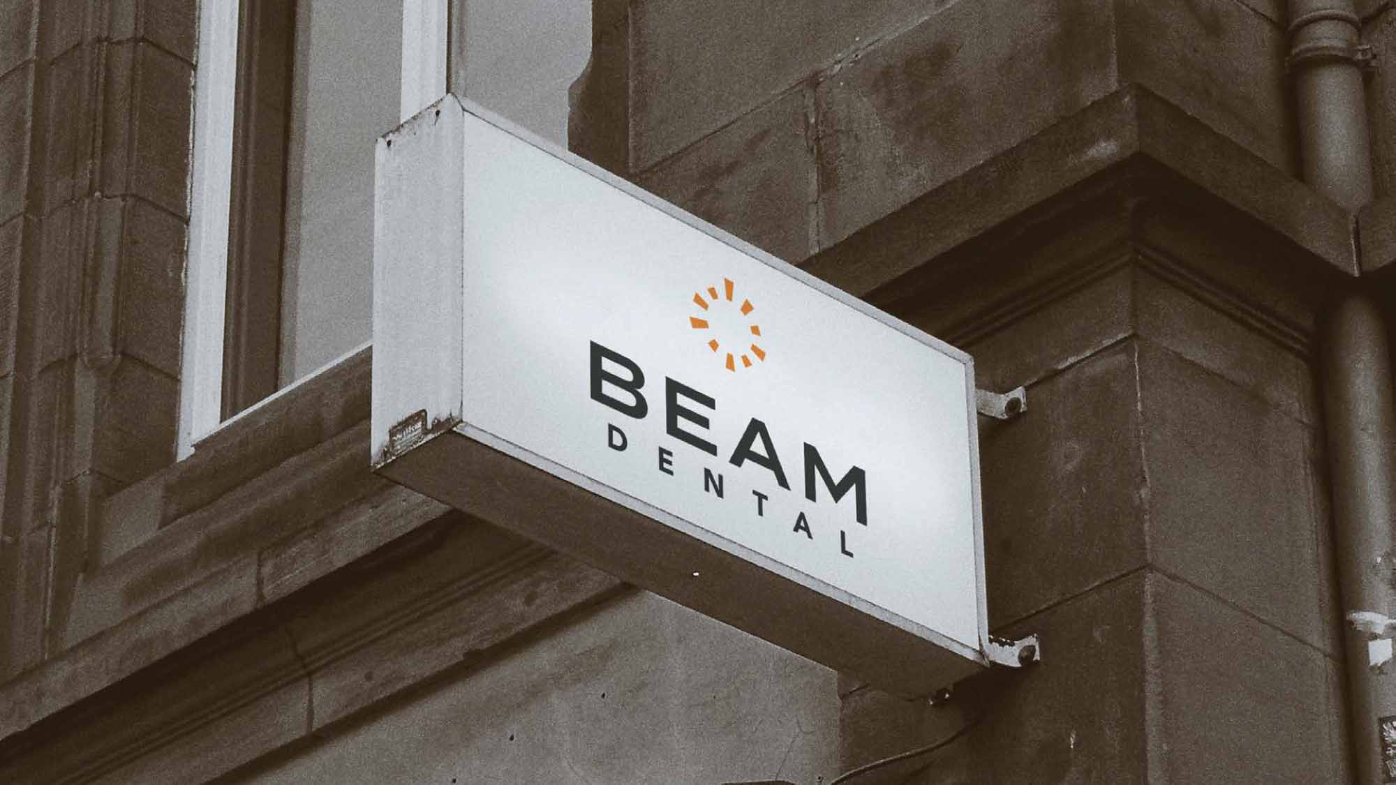
3. Beam Dental
With multiple locations in New York City, this client’s logo needed to stand out in a media-heavy metropolitan area. For this reason, we created a simple image with bright colors for a memorable icon that can be easily recognized from a distance.
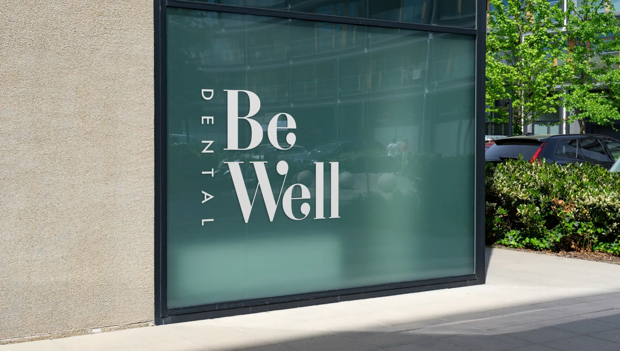
4. BeWell Dental
A font with the perfect personality was all this client needed to say yes to their word-mark logo. Modern, fresh, and a little bold (but not too much!), this logo invites patients to the BeWell Dental experience.
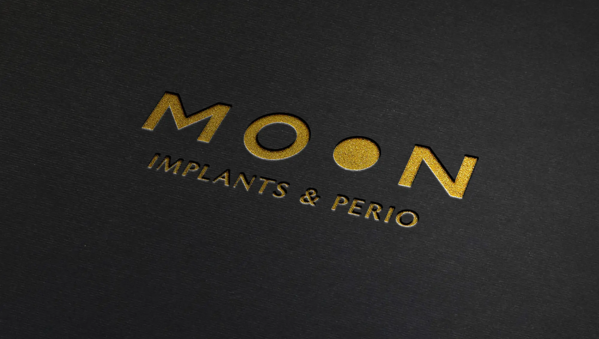
5. Moon Implants & Perio
With the last name Moon, this practice owner wasn’t sure whether to lean into celestial imagery or not. But with a modern logo that only hints at a moon, she found the balance she was looking for.
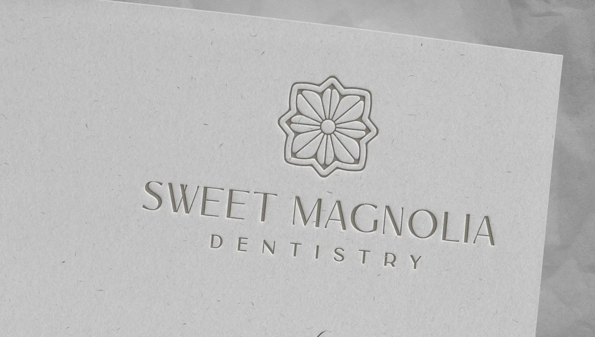
6. Sweet Magnolia Dentistry
Wanting a soothing, modern logo with a subtle rustic touch, Dr. Burnett chose this icon that represents the magnolia in the practice name, and also mimics a mosaic tile.
7. Charleston Dental Studio
Dr. Driscoll asked for a logo that was “beachy, light, and neutral,” so this was the perfect choice! The thin lines of the waves communicate a serene beach feel without being too obvious.

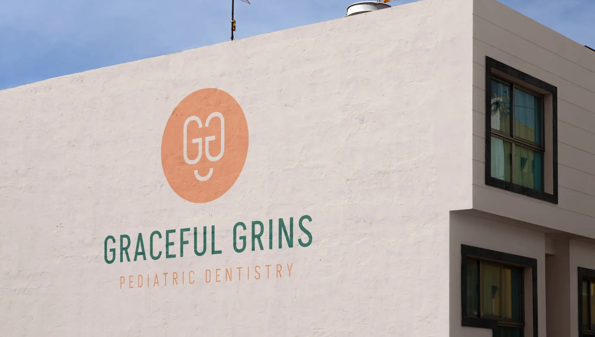
8. Graceful Grins
When a monogram becomes a smiley face, it’s a match made in heaven for a pediatric practice. Combined with peach and clover green, this logo is the perfect amount of fun and quirky.
9. CHS Dental
This may take the cake for the most balanced dental logo ever made! CHS Dental wanted a refreshed logo that took itself seriously and matched the luxurious feel of their website.
.jpeg)
10. Lighthouse Dental
Lighthouse Dental wanted something playful and modern for their inviting coastal practice. They fell in love with the lighthouse icon that looks like stained glass, with beams beckoning patients into their space.

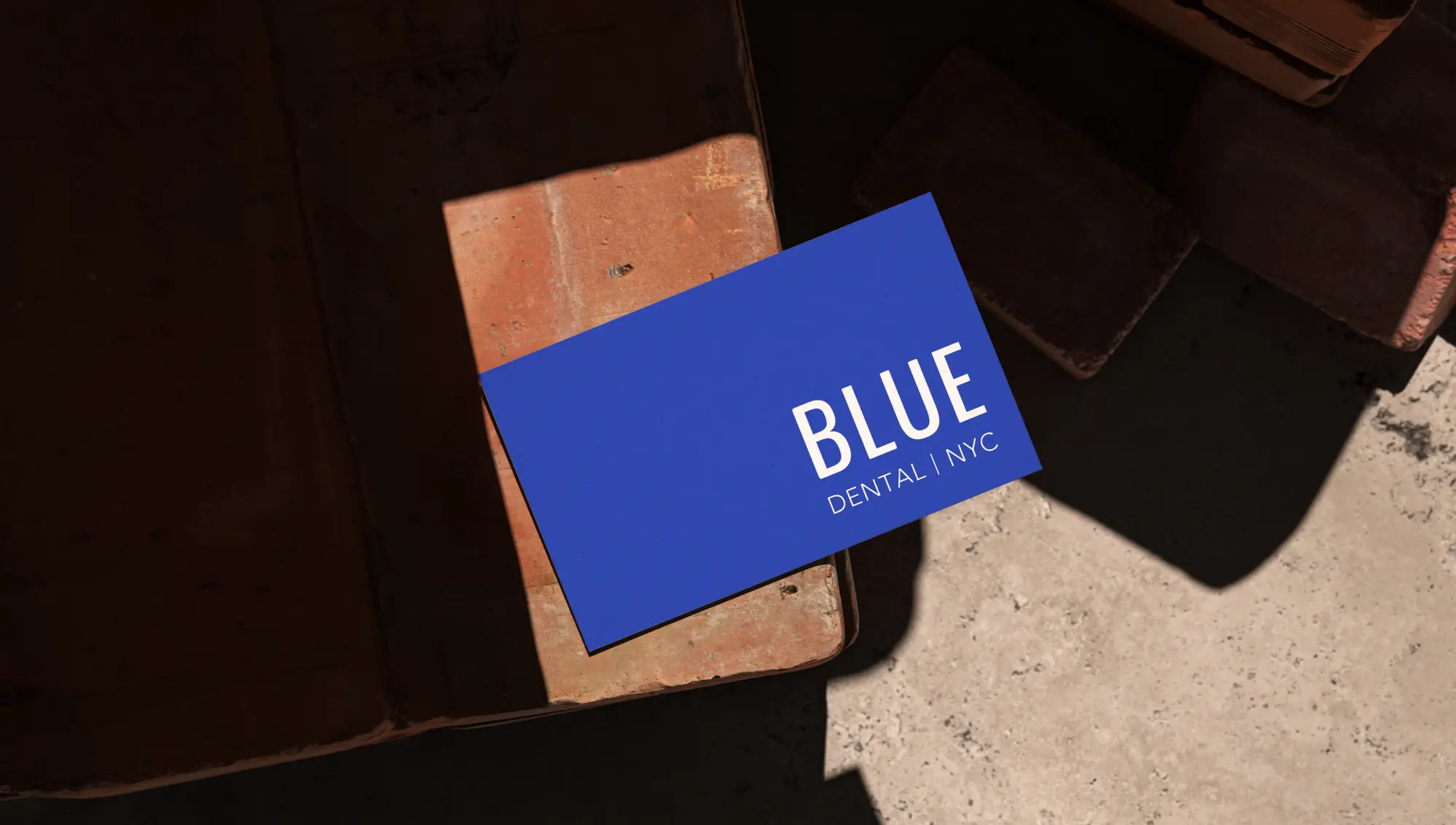
11. Blue Dental
The simplest of the simple is sometimes the best of the best (or, in this case, the bluest of the blue?). This practice owner wanted a bold, no-nonsense logo and the perfect shade of blue to communicate their identity.
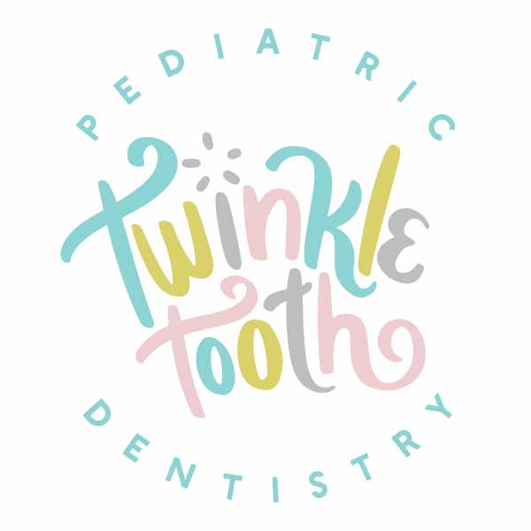
12. Twinkle Tooth Pediatric Dentistry
This hand-drawn font and surprising color combination made for an irresistible logo for this pediatric practice. Throw in some sparkle, and it becomes unforgettable!
.jpeg)
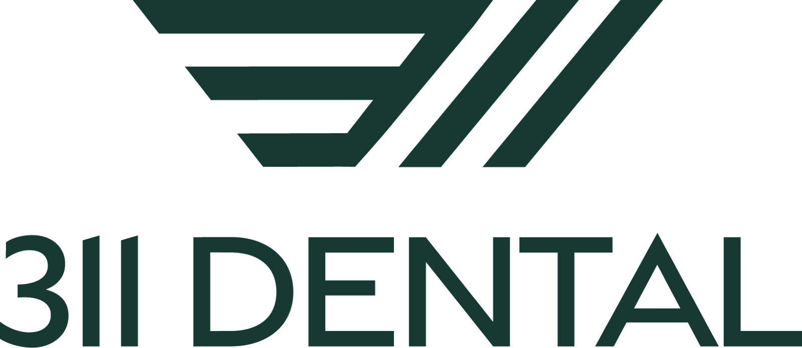
13. 311 Dental
Dr. Syed's practice has a sophisticated yet inviting vibe, reminiscent of that iconic Nordstrom style. His logo mirrors a dedication to offering sleek, specially catered dentistry, while the strategic use of diagonal lines (even on 311’s website) wraps patients in a seamless brand experience from start to finish.
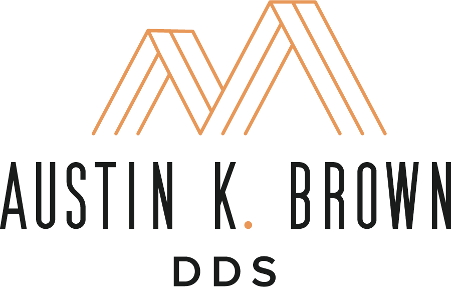
14. Austin K. Brown DDS
Inspired by the mountains of California, Dr. Brown's logo features clean lines and a poppy-inspired orange hue that symbolizes the morning sunrise. It's a visual metaphor for his practice's comfortable, homey atmosphere, where easing patient anxiety is at the heart of the experience.

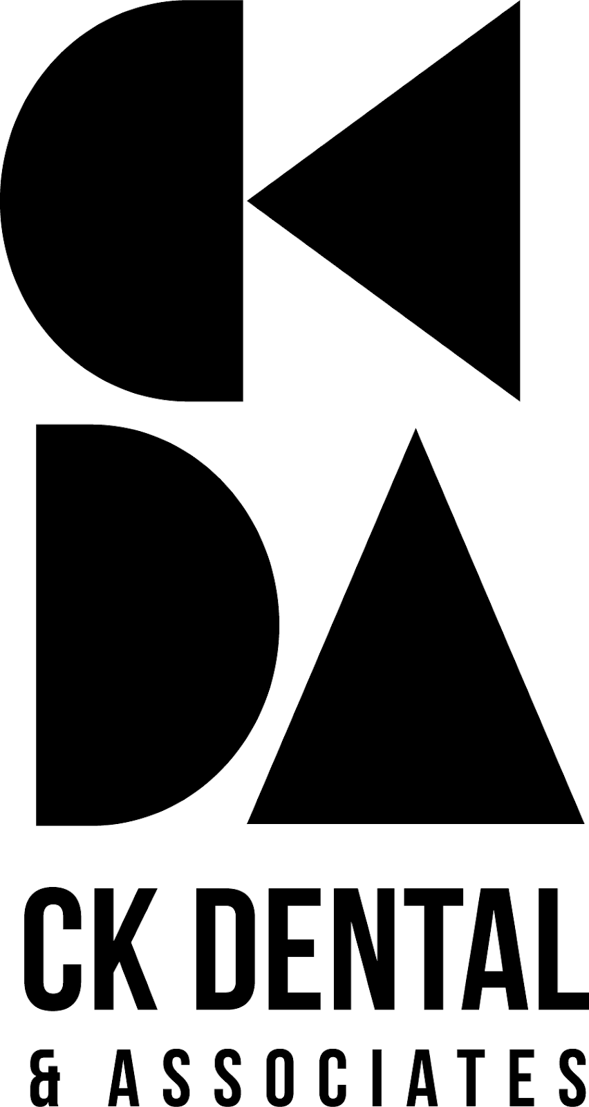
15. CK Dental & Associates
Who can resist trendy, mid-century modern vibes? Dr. Jenny and Dr. Woo's logo flaunts urban street chic with minimalist shapes cleverly hinting at "CKDA," adding an industrial edge to their modern practice. It's the hippest of dental logos, effortlessly cool and oh-so-stylish.
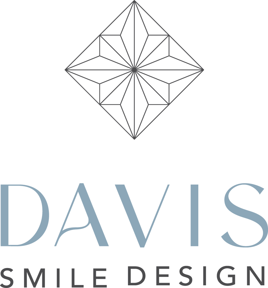
16. Davis Smile Design
Dr. Emily's logo captures her dedication to her patients with its intricate, diamond-like design, symbolizing the multifaceted nature of her personal connections and care. The clean lines and elegant typeface are a testament to a practice built on deep relationships and a commitment to crafting individualized, radiant smiles.
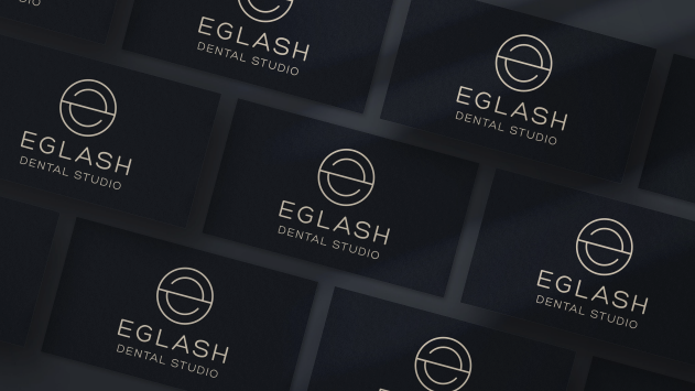
17. Eglash Dental Studio
Dr. Eglash's logo exudes a fresh, inviting aura with its uncluttered design. The crisp, modern typeface complements the clean lines of the abstract emblem. A visual identity that broadcasts their approach of excellence in dentistry – this brand promises a sleek, contemporary, and comfortable experience for every patient.

18. El Segundo Pediatric Dentistry
With one look at Dr. Houda’s logo (and her incredible office space), you feel the fun-loving, bright energy that fits the world of pediatric dentistry perfectly. Using vibrant colors and a hand-drawn style, this logo reflects a commitment to fun, comfortable, and expert pediatric dental care.

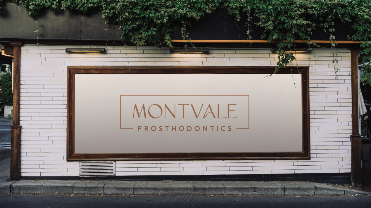
19. Montvale Prosthodontics
Montvale Prosthodontics' logo speaks to the high standard of professionalism and advanced education that Dr. Susie brings to her dental practice. The sophisticated, serif typeface, set against a clean background, conveys a sense of refined expertise and reliability.

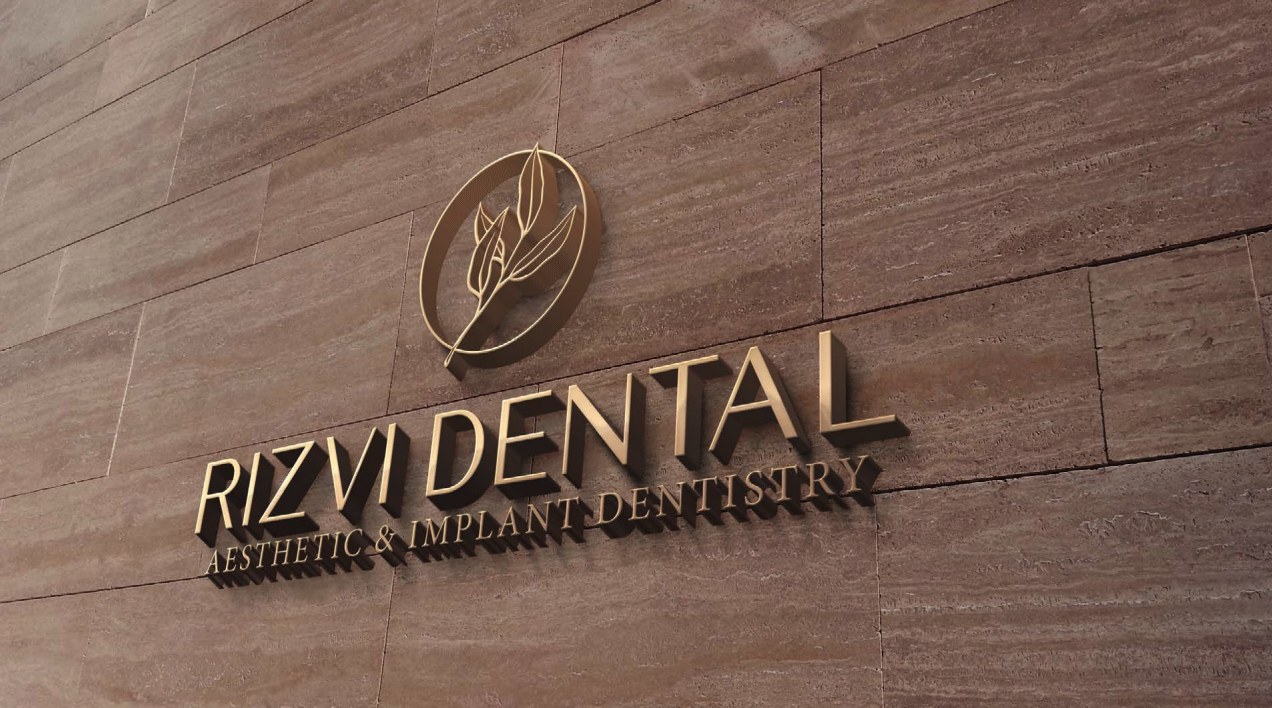
20. Rizvi Dental
This logo’s elegant leaf illustration embodies calmness and wisdom, and the gentle nature of the foliage mark symbolizes a soothing dental experience. Dr. Tahira's brand works to communicate a serene, enlightened approach to oral health, offering patients a tranquil escape for their dental care needs.

And there you have it– the best dental logos of the year! These designs don’t just look good – they set the tone for the patient experience before they even make an appointment, proving that a creative and balanced logo can make a world of difference.
.jpg)
.jpg)
