The Art of Dental Branding: 5 Steps For Developing a Visual Identity on Social Media
If a picture speaks a thousand words and we consume social media with our eyes first, what does your feed say about your dental brand without saying anything?

Establishing a consistent visual language across your social platforms (and all marketing materials for that matter), is serious business! It’ll help you attract followers, look more professional, stand out from local competitors, and convey your dental brand’s personality and values without saying a single word!
Not to mention, swiping through a brands’ feed that has a consistent look and feel is just so dang fun…
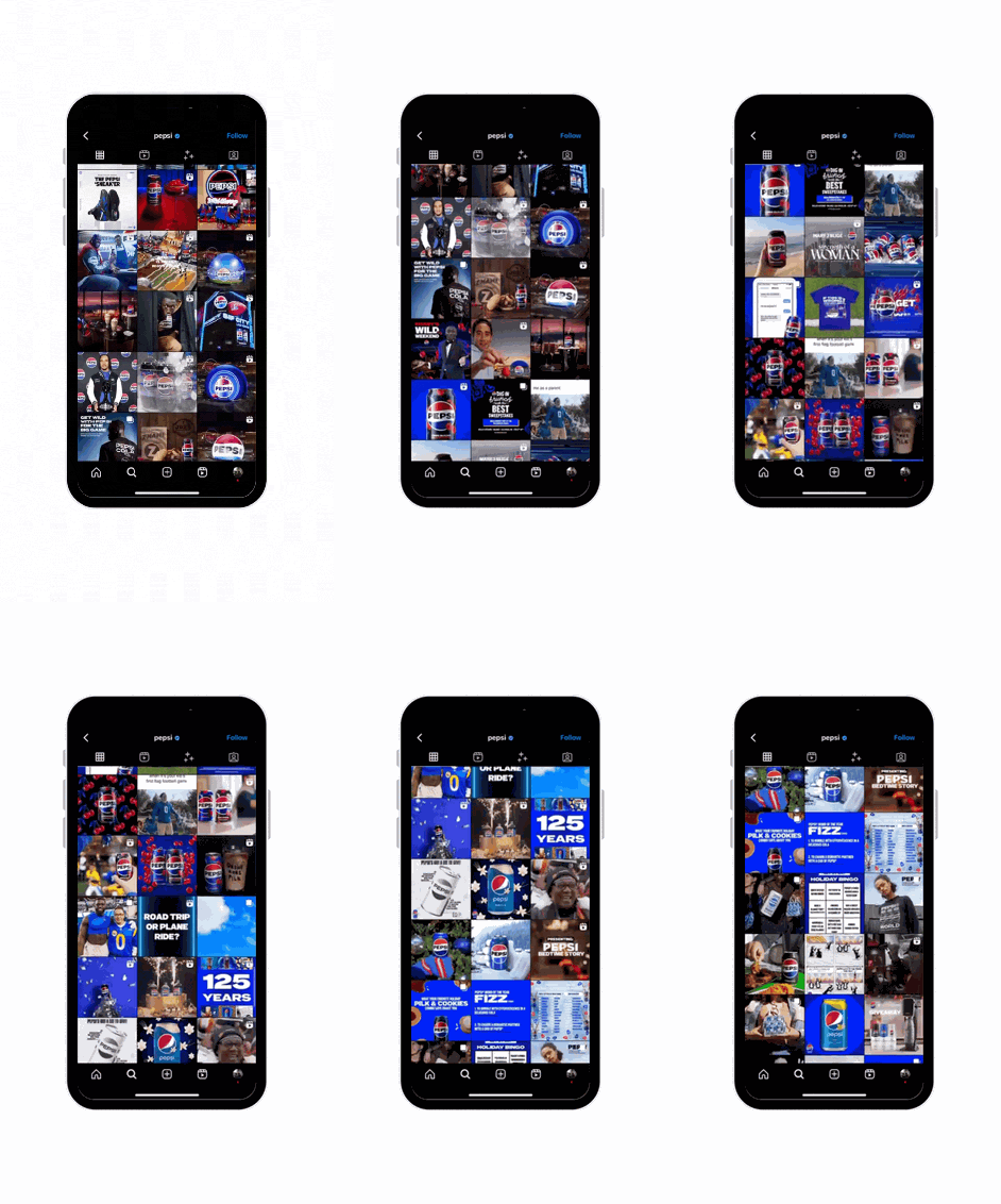
…so if yours is all over the place or nonexistent, what impression are you leaving on your audience? Or potential patients who find you on social?
If you want to elevate your visual branding, Studio 8E8’s resident Social Media Strategist (psst…that’s me) is here to help! The digital landscape on Facebook and Instagram is only going to get more crowded, so let’s explore how to break through the noise with a memorable and eye-catching visual brand identity.
Before we can dive into the fun stuff like choosing fonts and colors, we have to go back to the beginning. It all starts here, with step…
#1: VISUALIZE YOUR VALUES
Think about how the heart of your dental brand could show up in everything you do – visually speaking! Your values should permeate through not just the words or tone you choose for the website copy or social captions, but also in the visuals you use.
Have you ever seen this viral video of Mister Rogers remixed? If not, you’re in for a treat. And this song will be stuck in your head for the foreseeable future. Anyway, give it a listen and venture into the Garden of Your Mind for a minute. 🧘🪴Imagine your values as a guide for all the visuals you create.
On the flip, try and imagine if your brand was a restaurant. Would it be a cozy, rustic pizzeria or a sleek, high-tech sushi bar? Another really helpful tool is to create a brand mood board – more on that here! Head on over to Pinterest and start pinning colors, textures, imagery, or anything that speaks to the vibe you want your brand to give off!
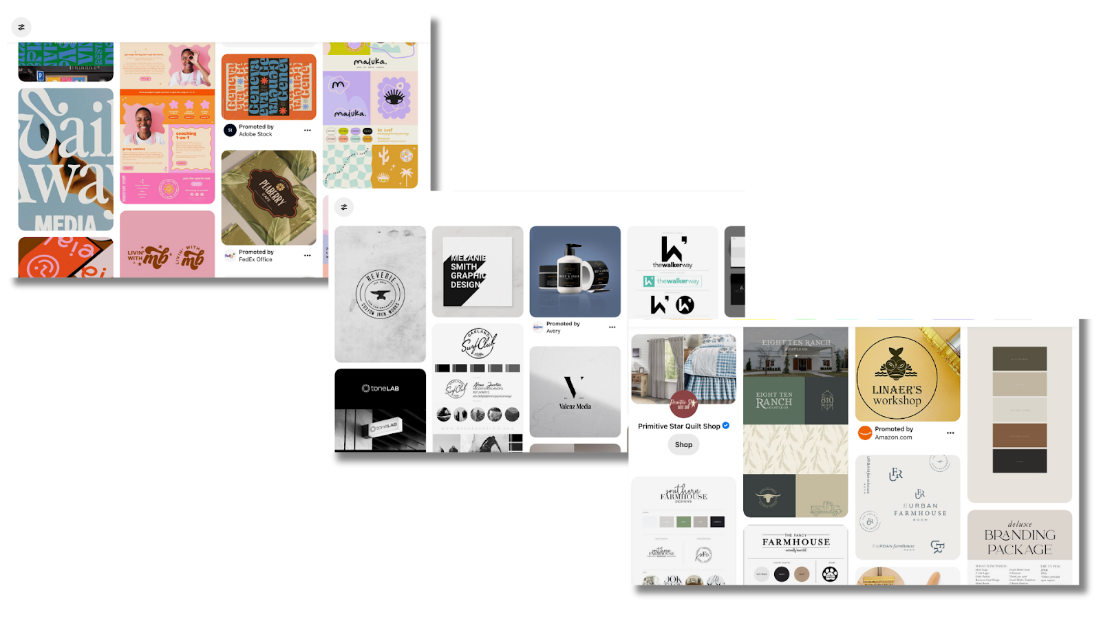
Is it fun and funky? Bold and minimalist? Remember there are no wrong answers or choices here! It’s all about what resonates with you and honing into why it does. Now wasn’t that fun?! Let’s move onto step…
#2: DEFINE YOUR TARGET AUDIENCE
Ask yourself, what kind of patients are you trying to attract? Who do you want your visuals to resonate with?
Let’s say you’re a pediatric practice aiming to reach millennial moms. Think about what their daily life might look like – what are they watching on TV? Did they tune into the superbowl to see if Taylor’s boyfriend won? Or maybe they can’t get enough of Beyoncé’s new country tune. Try to dig deep so you can craft your visuals and messaging so it feels like you’re having a direct conversation with them.
Mountain Dew, for example, is creating visuals that would probably repel a millennial mom but attract males between the ages of 18 - 24. Case in point:
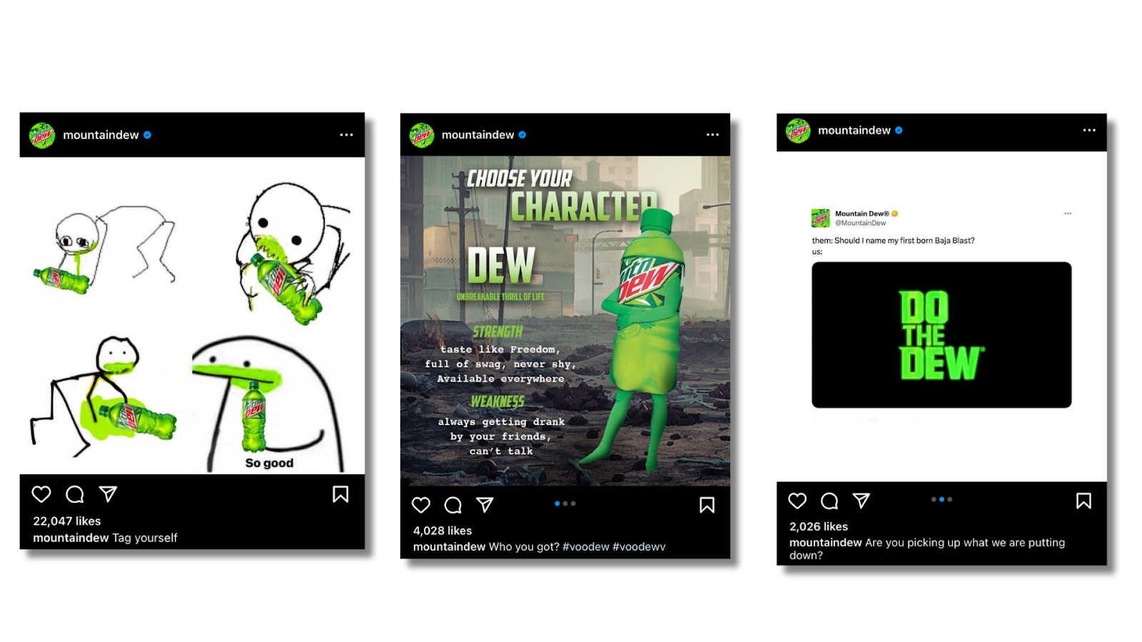
It’s uh, somethin! But clearly, they know exactly who they’re trying to attract and the visuals that resonate with them. Okay, now onto the real fun stuff for step…
#3: ESTABLISH YOUR COLOR PALETTE
The right color palette can help audiences recognize your brand instantly! Start by identifying the core colors of your logo, which will form the foundation of your color palette. 🎨Whether you chose those colors because you did a deep dive on color psychology, or they just plain looked cool, they’re now crucial in establishing your dental brand’s visual identity on social and beyond.
Let’s take a look at our friends from LoFi Dental who created this adorable logo and primary brand colors. If we head over to their Instagram, we can see these specific colors are the backbone of their feed’s aesthetic:
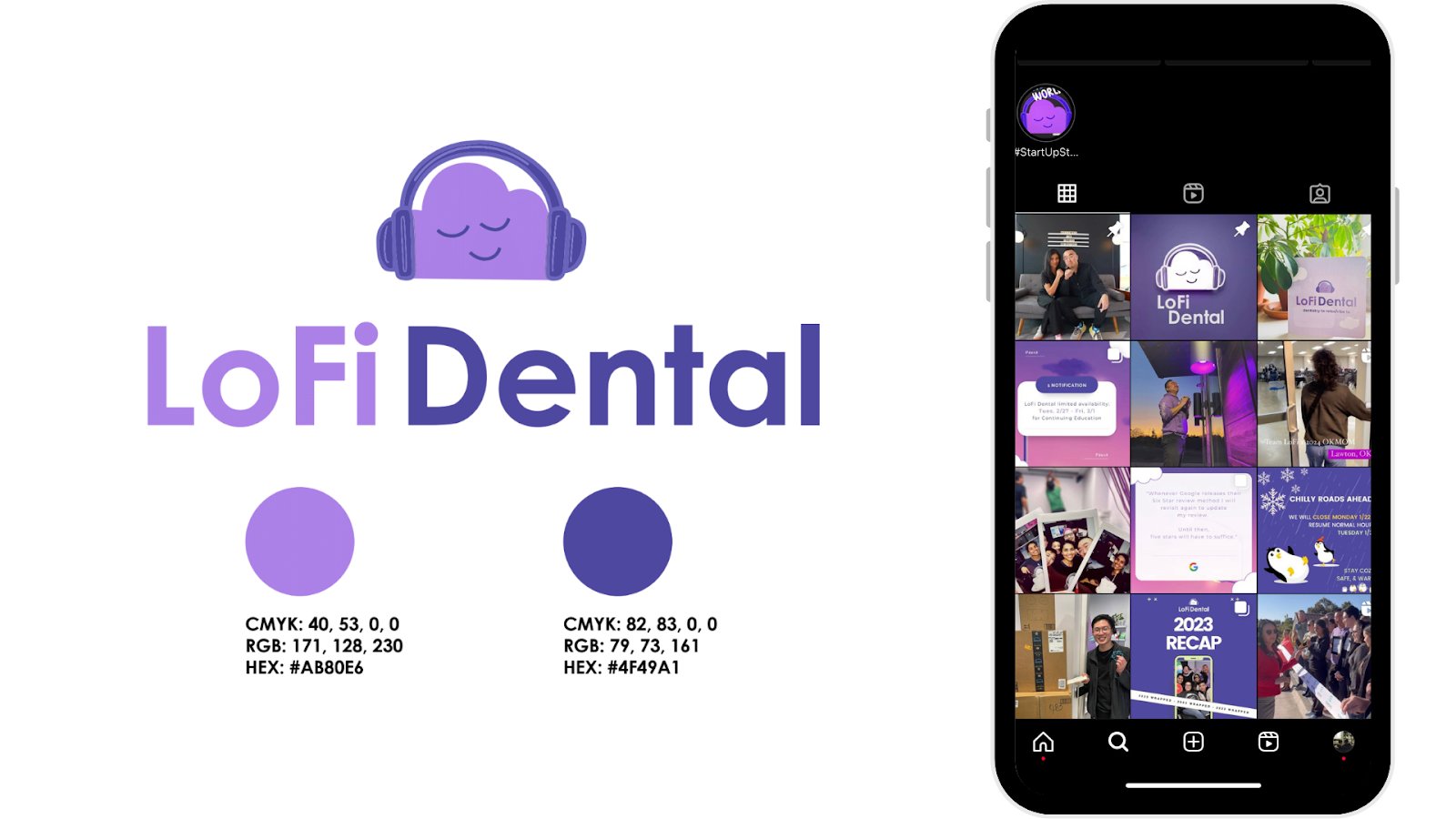
The strategic use of color here is ON.👏 POINT. 👏 If we examine some of their social graphics and the secondary colors used here, you can see how they beautifully compliment the primary colors:

By consistently adhering to this color palette across platforms, they’ve significantly enhanced their brand recognition and established a memorable visual identity! This not only reinforces their commitment to cozy vibes and modern care – it communicates these core values to their audience without having to say a word. 🤫
Once you create a palette that’s right for your dental brand, everything will start looking more cohesive across the board! If you need a little help getting there, give the Adobe Color wheel a spin and test how different colors look when paired together. Now onto the other heavy hitter for step…
#4: CHOOSE YOUR FONTS
Establishing your dental brand’s fonts is just as pivotal as choosing your color palette! Whether you opt for a font that’s bold and assertive or one that’s sleek and thin, it should align with your brand identity. Serif fonts are often associated with tradition, authority, and formality. Sans serif fonts are the opposite, symbolizing modernity, simplicity, and clarity.
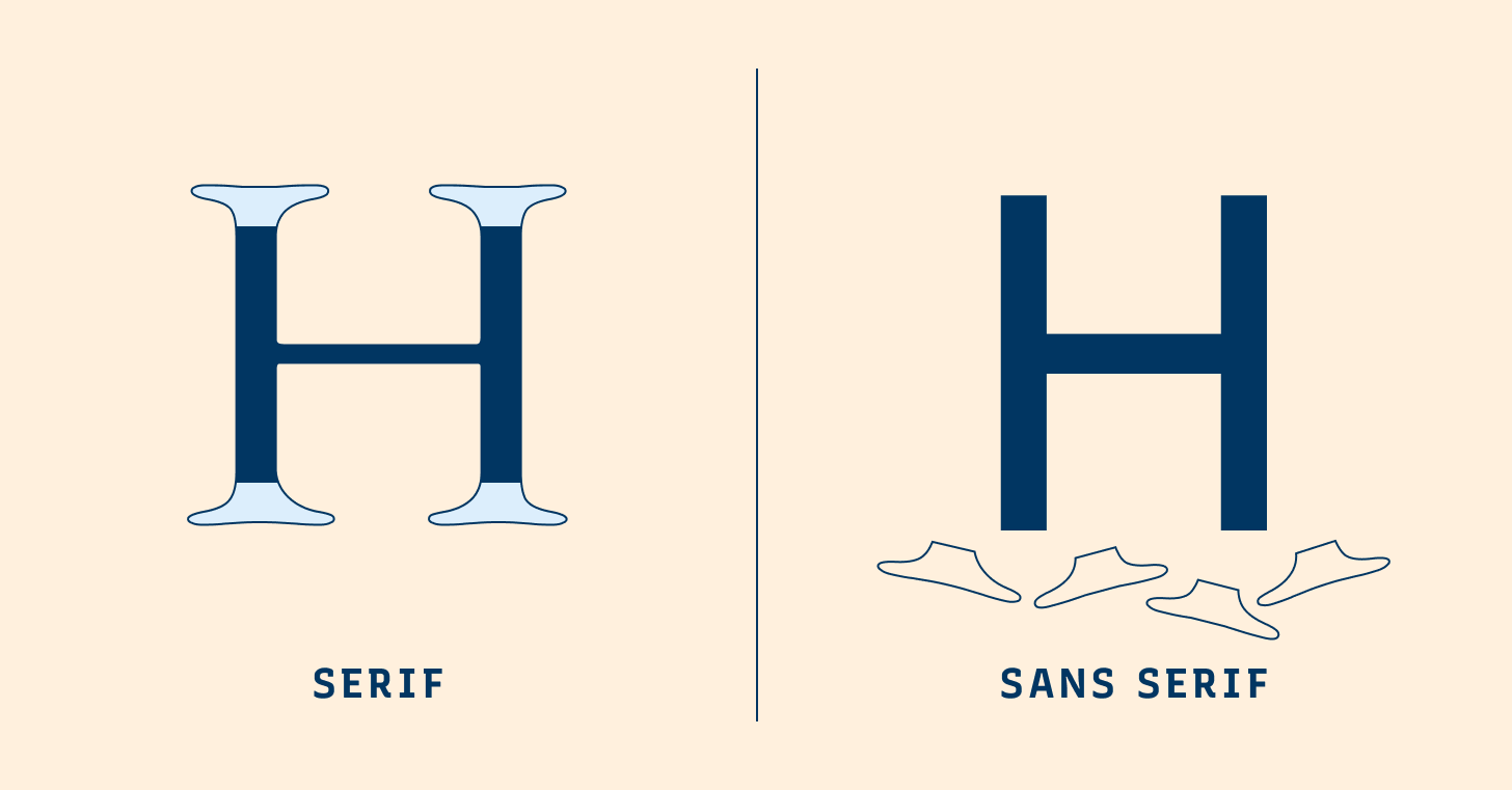
Most brands pair two main fonts that complement each other – take a look at this lovely serif/sans serif combo MailChimp uses for social graphics:

If pairing two fonts seems overwhelming, it’s all good! You can always pair different weights of the same typeface. Font “weight” refers to the thickness of the character, ranging from ultra-light to extra bold. The variance in weight can create a subtle contrast, as seen in Starbucks’ social graphics:
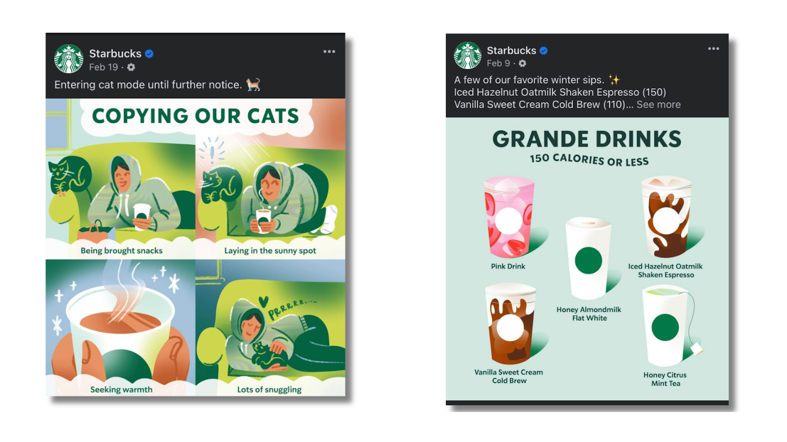
Always choose fonts that are easy to read and keep in mind the mood of your brand! If you’re feeling lost at sea with all the choices at your fingertips today or freaked out about licensing, stick to those that are available for free use on Google or check out some curated font pairings over on Canva! Now all that’s left to do is gather everything up for step…
#5: CREATE A BRAND KIT
Creating a brand kit is not only the last step, but a fundamental one in cementing your visual identity! It serves as a comprehensive branding guide for the colors, fonts, and logo options that make up the essence of your brand.
Compiling this all in one handy-dandy place guarantees consistency and is an investment in your brand's future - ensuring every piece of social content reflects your dental brand's visual identity. If you're not sure where to start, Canva's got you covered.
So how are you feeling?! Like you'll start viewing more social feeds with a critical eye? Ready to start flexing your newly found visual branding skills? Or maybe you need some extra guidance?
I'm always happy to chat about all things social media, no strings attached!


.jpg)
