Mood Boards: Tips for Discovering Your Dental Practice Style
CURATING YOUR VISUAL STYLE
There’s nothing I love more in the creative world than a good mood board. First, a preamble: I am of the Pinterest generation. I got engaged in 2012 and spent my last semester of college saving images of burlap, lace, and mason jars. I moved into my first apartment at the height of the Shabby Chic era and filled my stuffy little 1980s kitchen with silk peonies and floral print dinner plates. In my twenties, at the height of the engagement/bridal/baby shower era of my life, I aimed for instagram-worthy with every centerpiece and photo backdrop.
Was I annoying? Yes. Am I now an expert at pulling together images that create just the right ✨mood✨?
…I think so?
Either way, I’m going to tell you everything I know.
A second preamble: Why, though? If we have a creative team and awesome designers who know what they’re doing, why would you need to know how to make a mood board to help us create a custom, perfectly-crafted dental logo design?
We love that believing in our creative wizardry is part of the S8E8 client experience, but sometimes we have to pull back the veil and say, “Hey, we’re human and we need your help figuring you out.” And sometimes it involves a bit of awkward-looking dancing before we finally sync up and cha-cha together (aka figure out what really fits your brand). It takes a little time, but we get to know each other in the process, which helps our team serve you better.
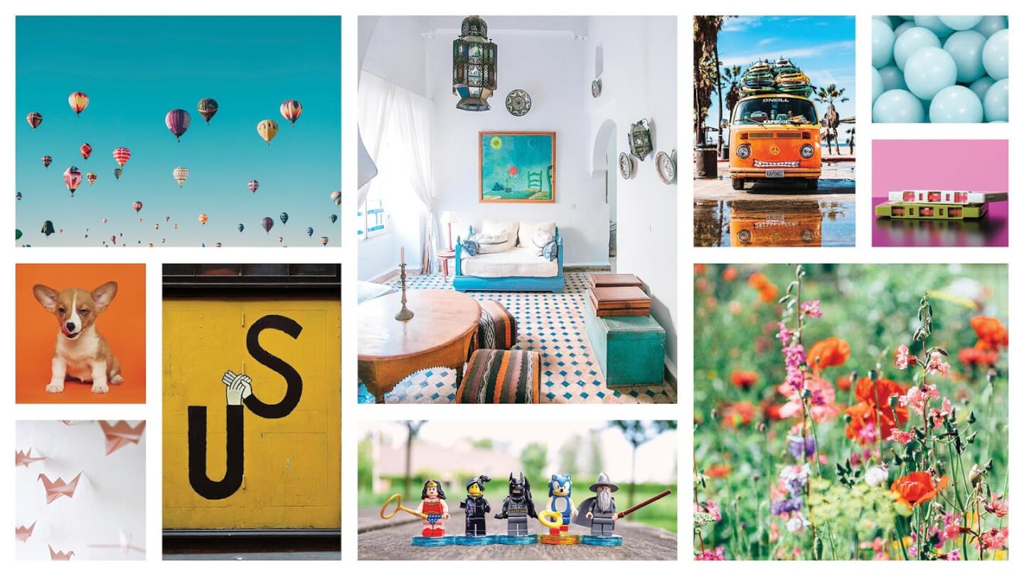
This board was created by our design team, and they describe it as: playful, fun, and energetic. What words would you add?
A mood board can help us achieve an even better win-win scenario. Having a strong vision for your brand is wonderful, but usually words alone aren’t helpful without visual support. Words often mean different things to different people. Someone could say “mid-century modern” and be thinking of psychedelic wallpaper, or they could be thinking of furniture with clean lines. There’s a lot within a word, sometimes, and images can really help support those words.
Whether you’re a startup or just refreshing your brand, a mood board can help any visual creatives who are engaged with your branding process, from interior designers to decorators to logo and website designers like us. 😎
IT STARTS WITH INSPIRATION
Step one to creating a perfect mood board for your brand is finding some images that really speak to you and your vision for your practice. As you get started, it’s important to know that you can cross-reference your inspiration. When I was planning a new look for my dining room, I pinned a floral bouquet, a bedroom, and an office that all had design elements that inspired something with a completely different purpose.
I like to have a broad starting point, rather than beginning with a favorite color or a specific room. Here are some ideas, and remember: don’t judge what speaks to you.
A location you love, or a place you’ve always wanted to visit.
-Other location considerations: Urban or rural? Contemporary or traditional?
-Best places to find this kind of inspiration:
-A travel photographer’s Instagram account.
-Look local - sometimes the best location inspiration is on your own block. Think about what stands out to you visually in your own community.
A piece of art you’re drawn to.
-Or even a particular artist or period of art. It can be weird! It can be irrelevant to oral health entirely!
-To find art inspiration outside the box:
-Consider textiles and other 3-dimensional art. Is there a fashion designer you love? A jewelry maker on the cutting edge?
-Watch some artists’ reels on Instagram or TikTok - sometimes the process is just as inspiring as the end product.
Your favorite interior design style.
-Or the interior design style that fits your practice best (more on that later).
-Best vacation rentals in [insert location inspiration].
-Wallpaper patterns from your favorite era.
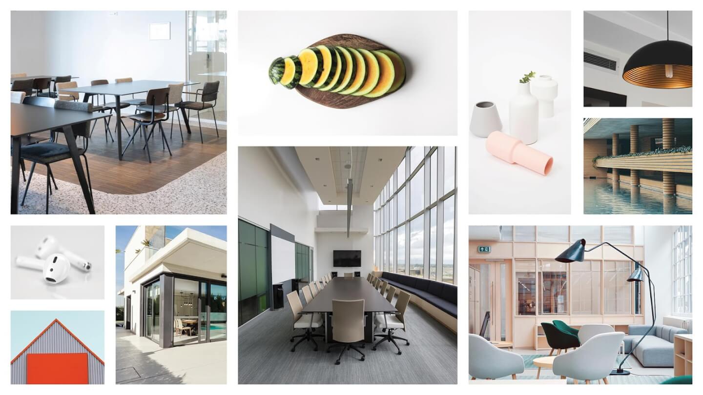
This board was inspired by minimalist, modern interior design, with clean lines and pops of color.
There are all sorts of places to find inspiration! Save all of your images somewhere you can see them all together. I use Pinterest at this stage because almost everything is searchable, and you can organize your boards really specifically. If something you’re looking for isn’t on Pinterest, you can always add it. Once you’re able to step back and view your work so far, often color palettes and other cohesive design elements will start to emerge naturally from what has stood out to you. (If you do need to narrow down your colors, we’ve got you covered.)
To play along, I started a mood board, pretending I was planning the aesthetics of a coffee shop. Here’s what it looked like after pinning almost 40 images:
AND THEN WE CURATE
Whether you’re looking around on Pinterest or dragging images from Google into a Word doc (no judgement!), once you start saving inspiration, it can be hard to stop. Hopefully your mood board is now filled with the weirdest, most beautiful things you’ve ever seen. Now the more difficult part begins: you’re going to have to say goodbye to most of it.
Here’s where you can start asking yourself some challenging questions:
What do I love the most?
-You’ve probably heard of Marie Kondo’s method of choosing what to keep around based on what “sparks joy.” This is not bad advice when it comes to mood boards.
-What feels the most personal to you?
-What’s something you’ve liked for a long time?
-Trends are super fun, but if there’s a style you come back to over and over again, that might be what’s right for you.
What will my patients like?
-You want to attract your ideal patients by making them feel comfortable in your space. Considering what might be most appealing to them is a great mindset for marketing!
-A good tip from our creative team is to ask yourself, “What are the three stores where my ideal patient most often shops?”
What works best for my space?
-Sometimes a modern style doesn’t quite work for a practice in an old colonial built in the 1930s. The good news is, you can often mix the old and the new, but the time period of your space can be a factor to take into consideration.
-When a physical space is limiting your design choices, see it as an opportunity to hone in on your style, rather than it being restricting.
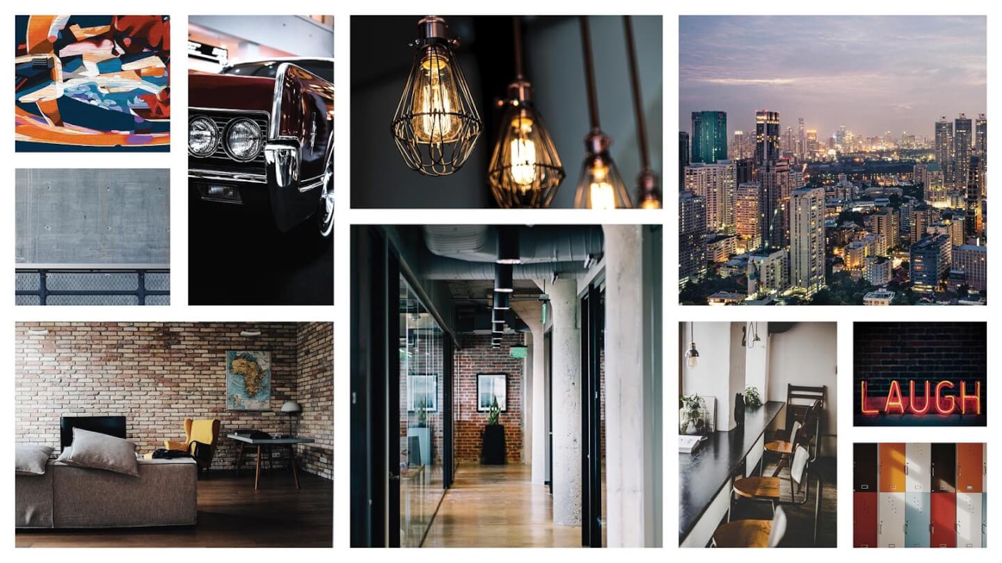
This board gives a very city, industrial feel. This look will make some people feel comfortable and energized, while others might find it a little too high-energy.
Hopefully, as you narrow down your images, you’ll start to see a clear aesthetic (or two) developing. Seeing patterns can really help as you make decisions about what to keep in your mood board. You might even see things you didn’t notice before. For my imaginary coffee shop, I started to see that my board could lean toward a more bright, airy look, or something more moody and edgy. You can see those two styles emerging after I cut the amount of images almost in half:
AND CURATE SOME MORE
A well-curated mood board is 7-10 photos. I know it doesn’t seem like much after you’ve started so broad, but 7-10 images is enough to give inspiration for a unique vision, without being too broad or too specific.
Return to your board again and:
Cut out anything that stands alone.
-If it looks out of place, it probably is. There’s something to be said about contrast, and sometimes a pop of something unexpected, like a show-stopping piece of art, is nice when you’re planning a space. But when you’re choosing an overall visual direction for your brand and something doesn’t match the rest, take it out unless it’s your absolute favorite thing.
Really decide on your favorite things.
-Keep using the questions above as you make decisions.
Here’s my coffee shop vision brought to life in just 8 images:
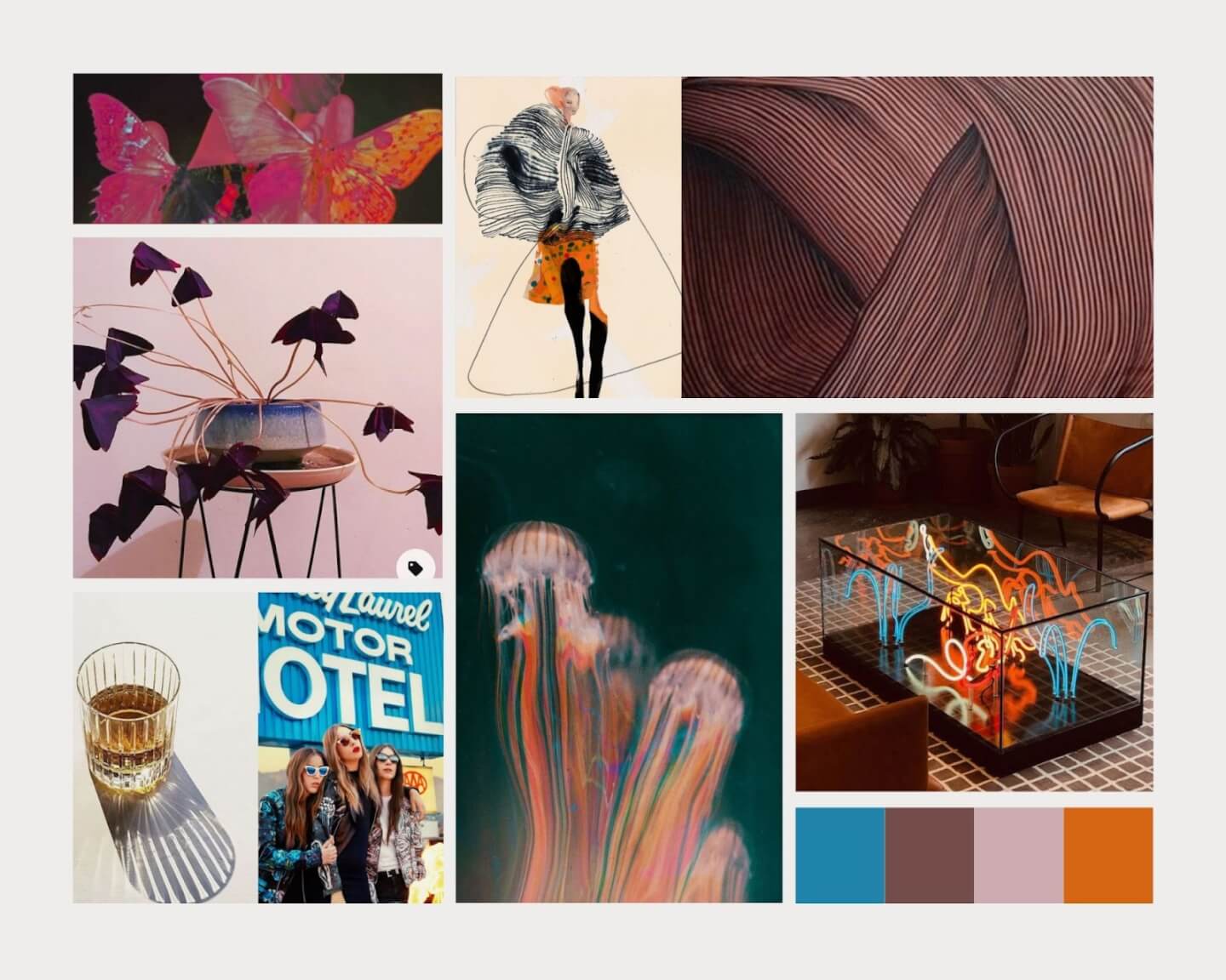
She’s youthful and moody, she’s fashionable, she’s electric and bright, and she’s vibrating color. This is the coffee shop for a group of 20-30 somethings dressed up to go out for drinks… caffeinated drinks. When I look at this board, I know exactly what it’s communicating. Eight pictures is better than 8,000 words.
All in all, a mood board should represent your visual aspirations and identity for your eventual branding and interior practice space. Will we be able to create an amazing, on-point logo and website without a mood board? Yes. Will a mood board help? Also yes - absolutely! Even for your own sake, the act of curating a mood board can help you clarify your vision. You certainly don’t have to have one for every room of your house (like someone I know 💁♀️). But if you use it as a starting point for your visual brand, a mood board can be a helpful tool to unify your look when you have multiple creative brains in the mix.
Speaking of creative brains, we happen to have a team full of them over here. If you’re ready to start exploring your visual brand, let us know. We’d love to chat.
.jpg)



.jpg)
.jpg)
